Big data, complex information sets, metrics, evaluations, scales, parameters, measurements, analytics, and ratings - can we actually see these abstracts with human eyes? This is where data visualization steps in, transforming abstract concepts into clear visuals that can reveal patterns and insights.
Data visualization is like rafting down a river - exciting, unpredictable, and always full of discoveries. In this article, we'll show you how to ride the waves of data to make the visualizations not only informative but also engaging. So, grab your paddle and hop aboard!
Don’t swim against the current
To begin with, the number one rule in the world of data visualization is not to swim against the current. Data flows with immense power, much like a mighty river. Instead of trying to force data into predefined visual frames, we should let it guide us, shaping our visualizations to match its unique rhythm and flow.
Just as navigating a river requires understanding its currents and twists, crafting effective visualizations demands a deep understanding of data types. Knowing whether you're dealing with numbers, categories, or time series helps you steer your visualizations to flow smoothly and convey insights with clarity.
ABC of charts based on data type
Human brains like patterns. By presenting data in clear, structured formats like graphs and charts, we leverage this innate ability, enabling readers to quickly grasp trends, anomalies, and insights. Let’s categorize common charts based on the types of data they best represent:
Time series data
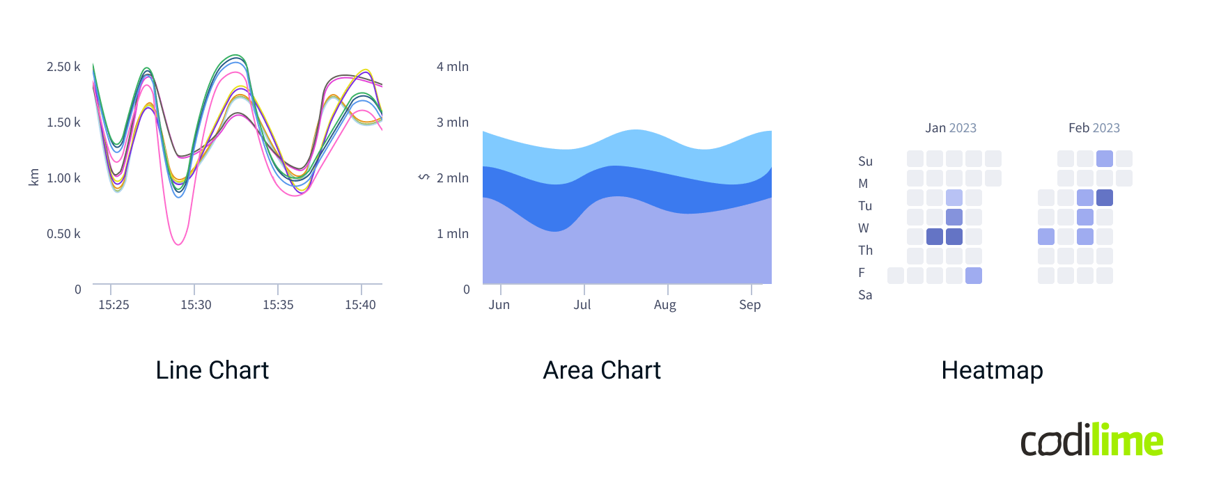
Time series data is crucial for tracking how metrics change over time, making it ideal for monitoring trends and performance. Use it when you need to analyze temporal patterns or predict future values based on historical data. The most popular time series data charts are:
- Line Charts: Ideal for tracking metrics over time, they reveal trends and changes, making them suitable for monitoring performance or progress.
- Area Charts: Combine line and bar charts to show how the numeric values of one or more groups change over time.
- Heatmaps: Effective for visualizing data density over time, like calendar heatmaps.
Categorical data
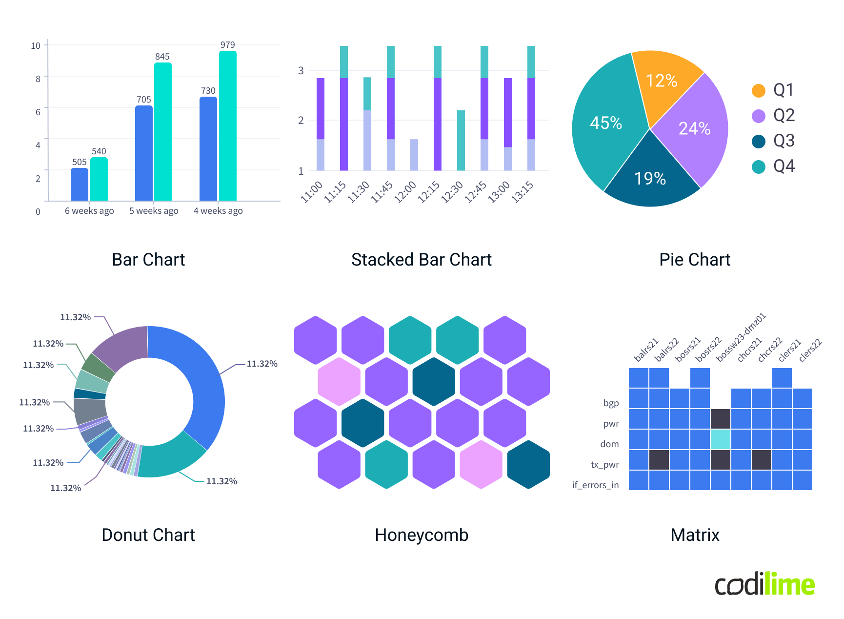
Categorical data represents distinct groups or categories rather than numerical values. It is best visualized using charts that clearly compare discrete groups or categories and help in understanding the distribution, frequency, and relationships between them.
- Bar Charts: Compare different categories by distributing data in bars.
- Stacked Bar Charts: Show category proportions and allow for comparison between different categories by stacking segments of different data series.
- Pie and Donut Charts: Display the proportion of a single value within a category or compared to a whole.
- Honeycombs (especially with a few levels of grouping): Display information in hexagonal shapes, where each hexagon (or cell) represents a category or a specific data point within a category.
- Matrices: Display data in a grid format where rows and columns represent different categories, and the cells contain data values corresponding to the intersections of these categories.
Scalar data
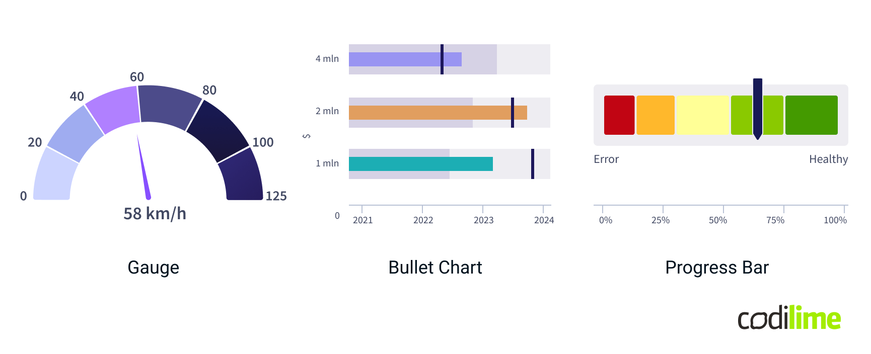
Scalar data represents single numerical values, often used to measure quantities that can be represented by a single value at a given point in time. It is best visualized using charts that clearly display individual data points and their magnitudes.
- Gauges: Display a single value within a range, often used for showing progress towards a goal or the status of a particular metric.
- Bullet Charts: Provide a way to compare a single primary measure to one or more secondary measures, often used for performance metrics against a target.
- Progress Bars: Indicate progress towards a specific goal or completion percentage.
Quantitative data
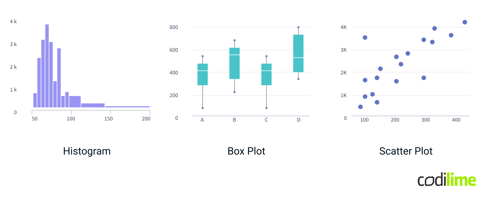
Quantitative data represents measurable values that can be analyzed statistically. It is best visualized using charts that reveal distributions, trends, relationships, and variations within the data.
- Tables: Display data in rows and columns for detailed analysis and comparison of numerical values. Ideal for presenting raw data, summaries, or cross-tabulated information.
- Histograms: Show the distribution of a single quantitative variable by grouping data into bins and displaying the frequency of values within each bin.
- Box Plots: Visualize the spread, central tendency, and outliers of a quantitative variable. Useful for understanding the range, median, quartiles, and any anomalies in the data.
- Scatter Plots: Correlate two quantitative variables by plotting data points on a Cartesian plane. Effective for identifying relationships, trends, and patterns between variables.
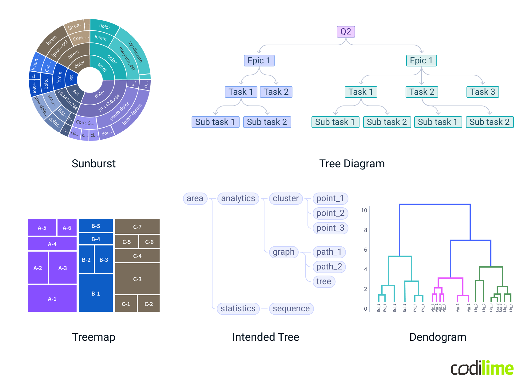
Hierarchical data
Hierarchical data represents information organized in levels or nested relationships. Effective visualizations for hierarchical data help reveal the structure and relationships within complex datasets.
- Sunburst Charts: Illustrate hierarchical data as concentric circles, with each level of the hierarchy represented by a ring. This visualization is ideal for understanding proportions and relationships across different levels.
- Tree Diagrams: Depict data in a tree-like structure, showcasing parent-child relationships and hierarchical levels. Useful for organizational charts and file system structures.
- Treemaps: Utilize nested rectangles to represent hierarchical data, with each rectangle's size and color reflecting various metrics. This is effective for visualizing proportions and categories within a hierarchy.
- Indented Trees: Display hierarchical data with indentation to represent different levels. Commonly used in text-based structures, such as file directories or organizational charts.
- Dendrograms: Show hierarchical relationships in a branching format, often used in clustering analysis to depict the arrangement and distance between clusters.
Geospatial data
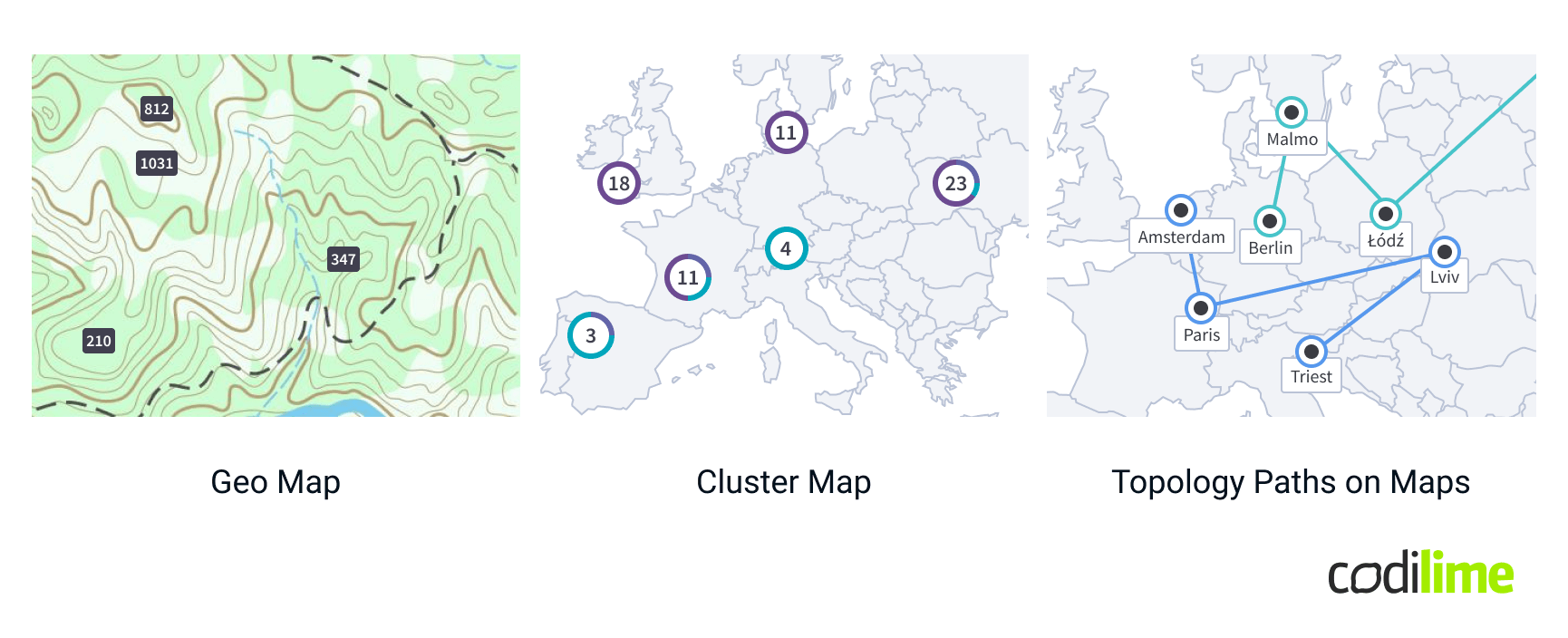
Geospatial data represents information tied to geographic locations, and it is best visualized using techniques that map data onto spatial contexts. These visualizations help in understanding the distribution and intensity of data across different areas.
- Geo Maps: Present data values across geographic regions, allowing for spatial analysis of data distributions and patterns. Maps are ideal for showing data related to specific locations or areas.
- Cluster Maps: Visualize grouped data points on a map, highlighting areas with higher concentrations.
- Topology Paths on Maps: Display the topology of structures over a geographic area, illustrating relationships and connections between various points. Useful for visualizing network topologies, such as communication networks or transportation routes, overlaying them on a map.
Topology data
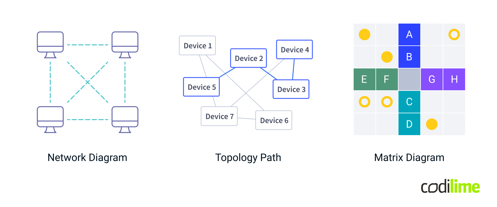
Topology data visualizations are essential for illustrating relationships and structures within complex networks or systems. Here are some common types:
- Network Diagrams: Display nodes (points) and edges (connections) to illustrate the structure and relationships within a network, showing how different elements interact with each other.
- Topology Paths: Highlight specific routes or connections within a network, emphasizing the flow of data or interactions between nodes.
- Matrix Diagrams: Show relationships between nodes in a grid or matrix format, where the intersections of rows and columns represent the connections or interactions between different elements.
All the graphs listed above are popular visualizations categorized by data types commonly used in observability applications. It’s important to note that some charts can be used across multiple data types. For example, a Table can effectively display both Quantitative and Categorical Data. Similarly, nested honeycombs can represent hierarchical structures, making them suitable for both Categorical and Hierarchical Data. Additionally, Topology maps are suitable for both Geospatial and Topological data types. And there are lots of less popular charts that are not listed above.
UX design principles
Choosing the right visualization type for the data is only half the battle. Even with the correct data to visualization match, numerous considerations still need to be addressed. Here are my main design principles for data visualization:
Clarity and simplicity: Ensure the visualization is clear and straightforward, avoiding unnecessary complexity to make the data easy to understand.
Context: Provide adequate context to help users understand the data, including labels, legends, and scales, to make the visualizations meaningful and insightful.
Consistency: Use consistent design elements such as colors, fonts, and chart types across visualizations to help users easily interpret and compare data. Reuse components and avoid creating custom solutions if they are not critical (do not design a new component for every new problem, as users like patterns).
Emphasis on key information: Highlight the most important data points or trends using techniques like color contrast, size variation, or annotations.
Accessibility: Ensure visualizations are accessible to all users, including those with disabilities, by using color-blind friendly palettes, text alternatives for visual elements, color modes, and keyboard-navigable interactivity.
Responsiveness: Design visualizations that adapt to different screen sizes and devices, ensuring they remain functional and comprehensible on different screen resolutions. Additionally, widgets themselves should be responsive, allowing the data visualization to fit well in various shapes and sizes.
Filtering and search: Enable users to filter data interactively, allowing them to focus on specific subsets of data, uncover patterns, and gain deeper insights without being overwhelmed by the entirety of the data set. Search functionality is absolutely necessary for data-intensive applications, encompassing both dashboard and widget search. Implementing a "search everywhere" feature is an excellent solution.
UX pitfalls
Principles often become complex in practice. A seemingly simple line plot can turn cumbersome and confusing when you have 101 lines instead of just one. Here are some examples of how dealing with extensive data can challenge UX designers and stress developers.
Pitfall #1: Untangling Line Charts
What could be simpler than creating a normal line plot widget with X and Y axes - not even creating, but implementing a “ready” solution from, let's say, the Highcharts library? This simple scenario rarely exists in the world of data-intensive applications, as the backend will send you dozens of lines - and you will be tasked with making it all clear and readable. What’s more, you might also have to display different Y-axes, each with a series of data.
In response to this challenge, our team had to design and implement quite a lot of enhancements to display all the lines sorted so that it would be straightforward for the user to read:
- First, we put lines into collapsible legends, allowing users to filter by selecting or deselecting any line on the chart. We also added grouping capabilities, so the user could filter out a group of lines, not only a single line.
- Second, we included tooltips with extra information for each line that appears when hovering. To keep the screen clear, we limited the tooltip size and added an option to lock the tooltip, letting users click a data point for easier exploration.
- Third, in addition to displaying past and current data points, predicting future trends was also desirable. This use case required us to implement settings for past and future time periods, as well as calculating line predictions based on the data trend.
Pitfall #2: Time rules it all
Data changes over time. Visualizations must account for various scenarios, including cases with no data or an overwhelming amount of data. Designing for edge cases ensures that your visualizations remain functional and meaningful under all conditions.
For example, our team faced the challenge of visualizing empty states for all widgets, as you can’t simply hide them when there is no data for certain periods. A smart approach to handling these scenarios is to clearly differentiate between intentional empty states and those resulting from missing data. If the empty state is expected and correct, make it obvious to the user. Conversely, if the absence of data is the issue, clearly indicate that data is missing to avoid confusion.
Pitfall #3: Run out of colors
Relying only on colors for data visualization is a risky approach. First, not all users can distinguish colors well. Second, the sheer volume of data can be overwhelming, and it may be impractical to generate a distinct color for every data point. Third, using too many colors can make it difficult to distinguish between primary and secondary elements, creating visual clutter. A much more reliable approach is to use appropriate grouping and data organization. If possible, minimize or avoid color use altogether to ensure a more accessible and comprehensible design.
Pitfall #4: Looking for contrast in Stacked Charts
Colors alone are not always enough. For example, in stacked event plots with several tiny color stripes layered on top of each other, achieving clear contrast can be extremely challenging. WCAG (Web Content Accessibility Guidelines ) standards provide clear guidelines for ensuring high contrast in text for accessibility purposes, covering elements such as buttons, badges, inputs, legends, and other text labels. However, there are no universal rules for color and contrast in data visualization, where hundreds or even thousands of data points might each require a distinct color. To make it even more difficult - you should avoid using status colors (red, green, yellow) for data sets, which makes the problem even worse.
One of the possible solutions our team applied to distinguish color sets stacked together was:
- Manual color selection should be tailored to the specific visualization type. We avoided using more colors than necessary by basing our selection on the expected data range. Excessive color shades reduce contrast, making it harder to distinguish data points. It is better to have a short list of distinct, repeating colors than a long list of hard-to-distinguish shades.
- Manual color ordering was also a good direction. We tried to place the colors in warm-cold + light-dark shades order so they created some kind of contrast.
- The final and most important advice based on our experience is to create both a colorful mode and a monochromatic one. Visually impaired users may rely heavily on contrast, and even users with standard vision can struggle with too many colors. We developed a monochrome version of the chart, which can be set as the default in user settings, and added the option to switch to it directly in the widget interface as well.
Pitfall #5: Which error is more of an error
Status colors are tricky for several reasons: a) A significant portion of the population has some form of color blindness; b) Different cultures associate colors with different meanings; c) When too many status colors are used, it can become difficult for users to remember what each color represents. The former problem is frequently seen in monitoring and observability apps: often, there are not one but many greens, several reds, and plenty of yellows. In this case, which red is more red, and which green is less green?
As a UX designer, I work hard to simplify user interfaces and reduce the number of status colors to as few as possible. There is no use in having more than one shade each of red, orange, and green for error, warning, and healthy statuses.
So when the need arose to show "almost healthy" widget cells, we spent some time deciding how to display this without causing confusion for the user. The problem was that sometimes, status widgets were shown as red simply because an error had occurred briefly in the past. Operational engineers were quite annoyed with checking out widgets that only seemed to present issues.
Our decision was not to add any additional status colors, as it would have an emotional impact and add cognitive load: why is there a different shade of green? Which green of those two is healthier? This would have been the wrong direction. The solution was simple and brilliant - just adding a dotted background to the same green color suggested, on one hand, that it is the same healthy status, but on the other, that it had some small turbulence in the past.
Tool selection and implementation details
For most of our charts, we decided to use the Highcharts package. This package offers multiple demos, helping us to see if it can meet all our needs. It was enough to cover most of our data visualizations.
Right out of the box, Highcharts is a potent tool. With just a few tweaks to the options, it provides interactive and attractive charts. However, as is often the case, the devil is in the details.
When it comes to custom requirements, Highcharts offers a wide array of options. The challenge is that the API Reference is extensive and not the easiest to navigate. Furthermore, some options can override others, which can be confusing. Although the documentation occasionally offers hints, it's not always the case. This can be a bit frustrating. On the plus side, for some options, there are small code snippets (or fiddles) provided. These snippets allow us to see how a feature might look in action or, at least, how it's supposed to look—if we haven't already applied another setting that conflicts with it. Sadly, the logging information provided is quite limited, which doesn't help much in troubleshooting.
Despite these challenges, I would still recommend Highcharts. It's an incredibly versatile package that handles updates gracefully. Making the most of Highcharts may require some patience and trial and error, especially when delving into the more complex customization options. But in the end, the quality of the visualizations it can produce and its adaptability make it well worth the effort. Keep in mind that to use it, you require a paid license!
One advanced tool we have used for showing data in tables is AG Grid. After looking at different options, we chose this one. Having used it for several months, we are quite satisfied.
The documentation for AG Grid is easy to understand and well organized. There is a good split between features that are free and those you have to pay for. When this article was written, you could use AG Grid for free, even for business purposes. AG Grid is designed to handle large amounts of data efficiently, which means your tables load quickly and smoothly. It also lets you customize nearly every part of your tables, from the way data is displayed to how users interact with it. Whether you're adding sorting, filtering, or grouping capabilities, AG Grid supports it. We would definitely recommend it.
There was a requirement to display data on a map of the United States. For this purpose, Mapbox-gl proved to be an ideal choice. It's a robust tool, offering extensive guides on accomplishing various tasks. For our project, we needed to create custom markers, such as nodes and edges, with the capability to cluster them as the user zooms in or out.
Getting started with Mapbox-gl can be somewhat challenging due to its comprehensive internal API, covering aspects like layers, sources, and, in my view, the most complex part, expressions. Expressions allow for the dynamic calculation of data and styling.
Although the Mapbox-gl API is feature-rich, it could not fulfill all our requirements on its own. Therefore, we integrated the supercluster package for additional functionality. Overall, Mapbox-gl is a visually appealing and potent mapping solution. Despite the initial learning curve, I would certainly recommend it.
To utilize this package, you must have an API key, and it operates on a pay-as-you-go billing model. A generous number of monthly requests are free, and charges apply only after exceeding this limit.
In our projects, besides displaying maps, we encountered the need to depict behaviors not related to latitude and longitude. During our search for a solution, we discovered the Reactflow package, which turned out to be ideal for representing topologies. Reactflow's core functionality is not only straightforward but also easy to grasp. Modifying its visual aspects to suit our project's needs was fairly simple. It provides a smooth and efficient user experience that meets all our use case requirements.
One of the biggest perks of using Reactflow is that it's free. However, we felt inclined to offer our support, which revealed another advantage. Upon contributing, we were introduced to more advanced options. Although these sophisticated capabilities are attainable under the free plan, receiving such insights as a gesture was highly appreciated. It clearly demonstrates the ease with which Reactflow can integrate with other packages, like 3d-force, showcasing its versatility and cooperative potential.
Own implementations
Sometimes, the packages we tested didn't meet our needs. This happened for a couple of reasons: either the functions (APIs) they offered were too basic, or the demands of our project were too broad for pre-made solutions.
We faced the challenge of creating complex visuals like Honeycombs, Matrices, or Correlations from scratch. This process demanded a lot of time and effort to ensure the performance and results were up to our standards. However, a positive aspect of building these from the ground up was the freedom to customize anything we wanted without being constrained by the limitations of an existing API.
In conclusion
This article has delved into the nuances of crafting effective visualizations in observability apps, providing a guide from design principles to real-world implementation. Here are the key takeaways:
Match visualizations to data types: Choosing the right chart or graph for your data - whether it's time series, categorical, or geospatial - is crucial for clear communication. Aligning visualizations with data types helps users quickly interpret and act on the information.
Stick to design principles: Successful data visualization hinges on clarity, context, and filtering capabilities. Focusing on these aspects enhances readability and usefulness. Consistent design and interactive features further boost user experience and accessibility. Nevertheless, you will never avoid challenges, as visualizing real-world data comes with its own set of pitfalls, like managing large data sets and ensuring high contrast for accessibility.
Choose and customize tools wisely: The tools you pick - whether it's Highcharts for interactive charts, AG Grid for detailed tables, or Mapbox-gl for geospatial data - can greatly impact your visualizations' effectiveness. Sometimes, custom implementations are needed to meet specific needs, so flexibility and adaptability in tool selection are key.
Embrace continuous improvement: Data visualization is always evolving. Staying updated with best practices and new tools is essential. The challenges and solutions discussed here provide a foundation for continuous learning and adaptation, helping you refine your approach and enhance your visualizations' impact.


