While building a new software product, development and UX teams usually focus on its functionality and usability. But do you know if your product is accessible? Why does it even matter? What is the difference between usability and accessibility? Read on to find out what accessible design is, what it isn’t, and how to make it work for your product.
What is accessibility design?
In terms of UX and UI, accessibility design is extremely important. The designer should always keep in mind that users might encounter the app or website in many different ways. People with disabilities often use supportive software or devices that cater to their needs.

Accessibility – what does it mean?
The dictionary definition of accessibility is pretty simple. If something is accessible, it means that it’s easy to reach, obtain, approach, or understand. In design terms, the concept of accessibility mostly relates to people with disabilities. For example, elevators make public transportation accessible for wheelchair users, and subtitles or sign language can ensure movies are accessible to people with hearing impairments.
Designing for accessibility means inclusivity for every user in every situation. It’s not only about disabilities but also circumstances. The product should be usable no matter the user’s limitations – whether permanent or temporary. People with disabilities make up 15% of the population . Excluding such a large group of users would be a big business mistake. This is why accessibility in design is just as important as usability.
The main challenge of accessibility design is that the designer may not fully understand the needs of users with disabilities. That means that even with the best intentions the product might end up excluding some users.
Types of accessibility
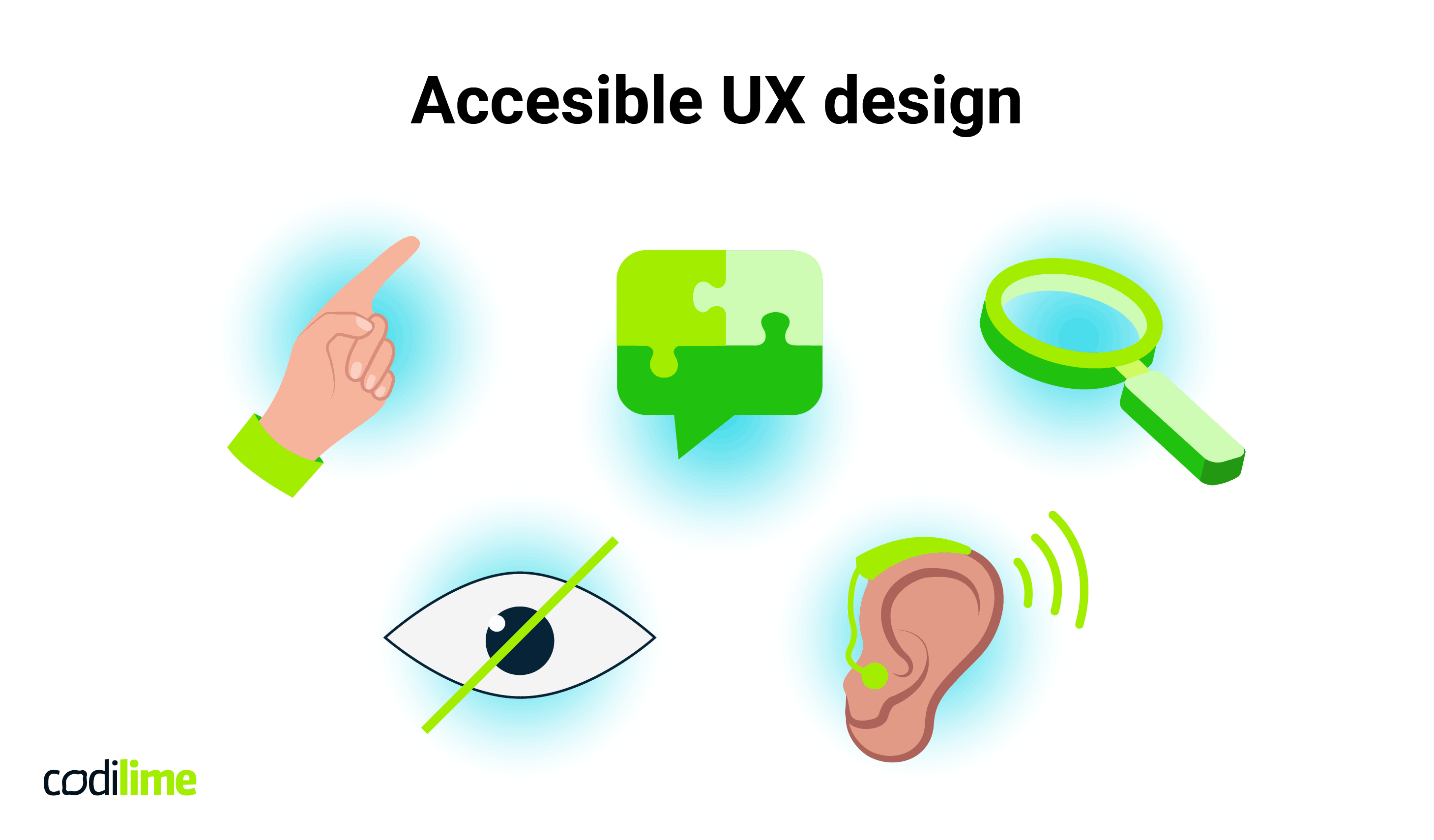
The types of accessibility barriers that can be addressed in UX design are:
Visual
For example: color blindness, amblyopia.
Mobility
For example: wheelchair users, tremors in the hands.
Auditory
For example: hearing impairments.
Cognitive
For example: dyslexia.
Seizures
Especially photosensitive epilepsy.
There are also accessibility barriers that may arise for any user due to their temporary circumstances, for example using a defective device or limited mobility due to injury.
Designing for accessibility – why is it necessary?
Accessibility in design is a concept that aims to help mainly people with disabilities. However, it can make a product more user-friendly for all. Accessibility makes a product perform better in many situations, and is part of the reasons why UX design is important.
For example, proper contrast makes a website readable for a person with color blindness, but also someone with perfect vision using their device outside on a sunny day. Another example is subtitles make a video more accessible to a person with a hearing aid, but also for someone who doesn’t understand the language perfectly or has their device on mute. Let’s not forget about any temporary movement restrictions that can happen to anyone. Keeping disabilities in mind during the design process will result in a product that is not only usable but inclusive for all.
Another benefit of implementing accessible design in your product is the impact on brand image. Inclusivity is a value important to a large number of users. Many brands want to be seen as inclusive and, as we all know, actions speak louder than words. Accessible design makes a product available to all, providing a positive experience and enhancing brand image.
Why should accessibility matter to your software product?
Designing for accessibility makes the product useful for a larger audience. It caters to a largely excluded demographic that, unfortunately, is often faced with limited options. Inclusivity can put you one step ahead of your competition. And it is also the morally right thing to do.
Designing for accessibility guidelines
The job of the designer is to make sure the product will be just as usable for people with disabilities as it is for non-disabled people. This requires developers and designers to consider all the issues and circumstances anyone may encounter. This is also the purpose of a kickoff meeting when planning the product.
What should you keep in mind while designing for accessibility?
There already are strict guidelines that offer clear advice for accessibility and usability benchmarking for a product's design. The World Wide Web Consortium developed the Web Content Accessibility Guidelines . This document helps to understand accessibility and evaluate your product. It also became a legal requirement in the US in 2021. In the EU there is a comparable directive, the European Accessibility Act
, which follows similar rules.
In both of these documents, there are four main principles that can be presented as a set of questions to ask yourself during the design process.
-
Perceivable
Can you perceive the content in different ways? (e.g. read a video transcription.)
-
Operable
Can the site function easily without using a mouse or complex interactions?
-
Understandable
Can you understand the information on the site and how the user interface functions?
-
Robust
Can assistive devices (such as screen readers) understand the website?
These guidelines are the basics of accessibility design. Another way of designing more inclusively would be thinking of people with different limitations and testing the website from their perspective. This means creating a few fictional personas with different kinds of barriers and thinking about how they would use the product – what kind of assistive software and device would they use, and how would the interface look to them? This kind of testing brings insight and shines a light on new issues.
Accessible Design best practices
Designing for accessibility is often perceived as a challenge or a limitation on creativity. And it is true that some of the guidelines are strict and implementing them may sometimes make the interface less visually exciting. But an exciting website that is not accessible to all users is simply exclusionary, and therefore not a good design. Let’s take a look at a few ways of designing websites for accessibility.
Use different visual cues than color
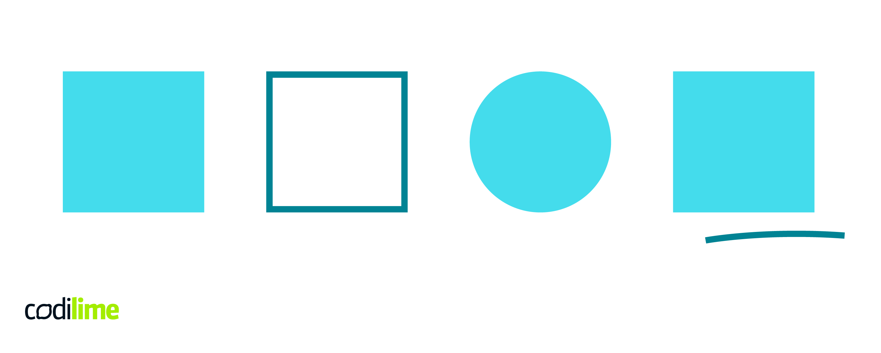
Using color is an efficient and easy way to communicate something to the user. For example, while logging in the password box turns red to indicate the password was wrong. But a person with severe color blindness wouldn’t notice. This is why it’s important to use a variety of visual cues, such as thick borders, error icons, or underlined text.

Don’t shy away from contrast
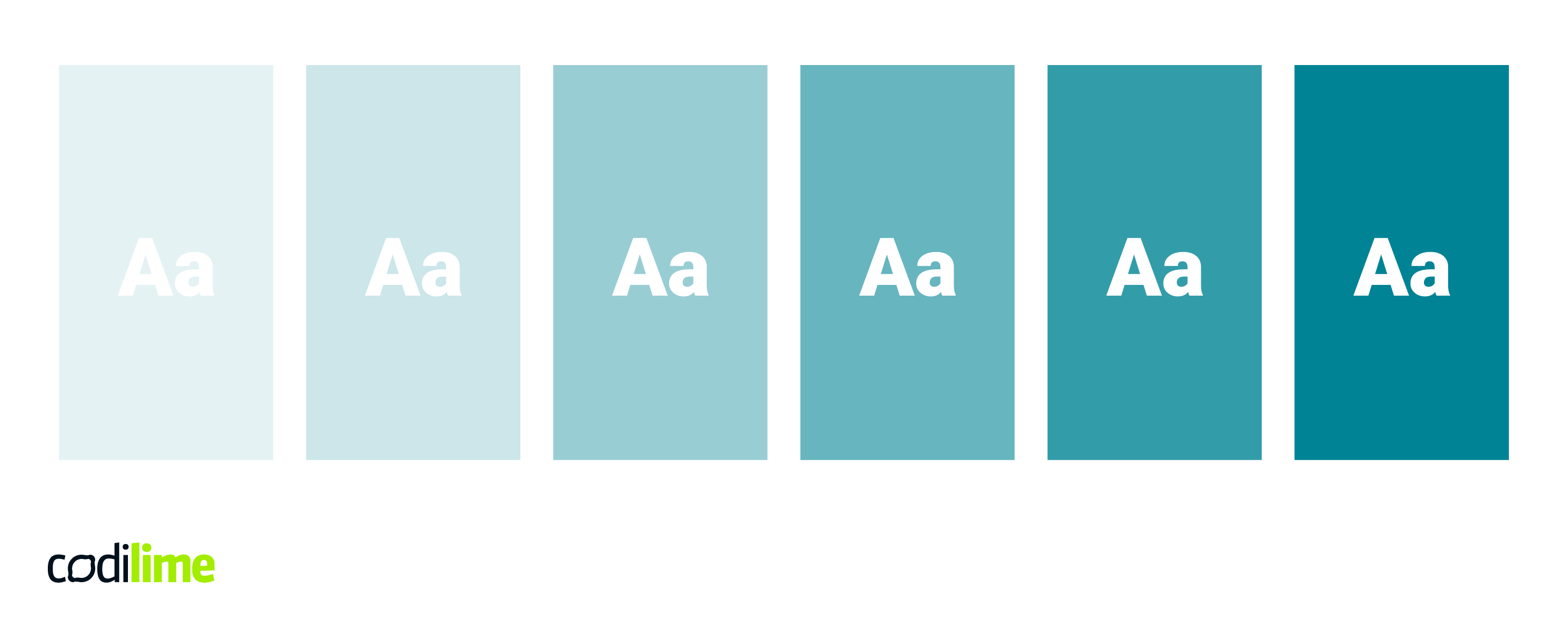
Even though they do look nice, low-contrast texts are not readable by all users. Accessibility guidelines precisely specify the contrast ratio between text and its background. It should be at least 4.5 to 1. It helps people with color blindness and low vision, or even someone using a low-quality screen.

Make your product compatible
People with disabilities often use supportive software. This means that an accessible website should be easily read by a screen reader, images should have alt text, and the interfaces should be easy to navigate without a mouse. Make it usable for keyboard-only users - that means there should be no links or buttons that are visible only when hovered over.

Check out our article about UX trends for 2022 - some of them can be useful in accessible design.
Accessible, universal, or usable design?
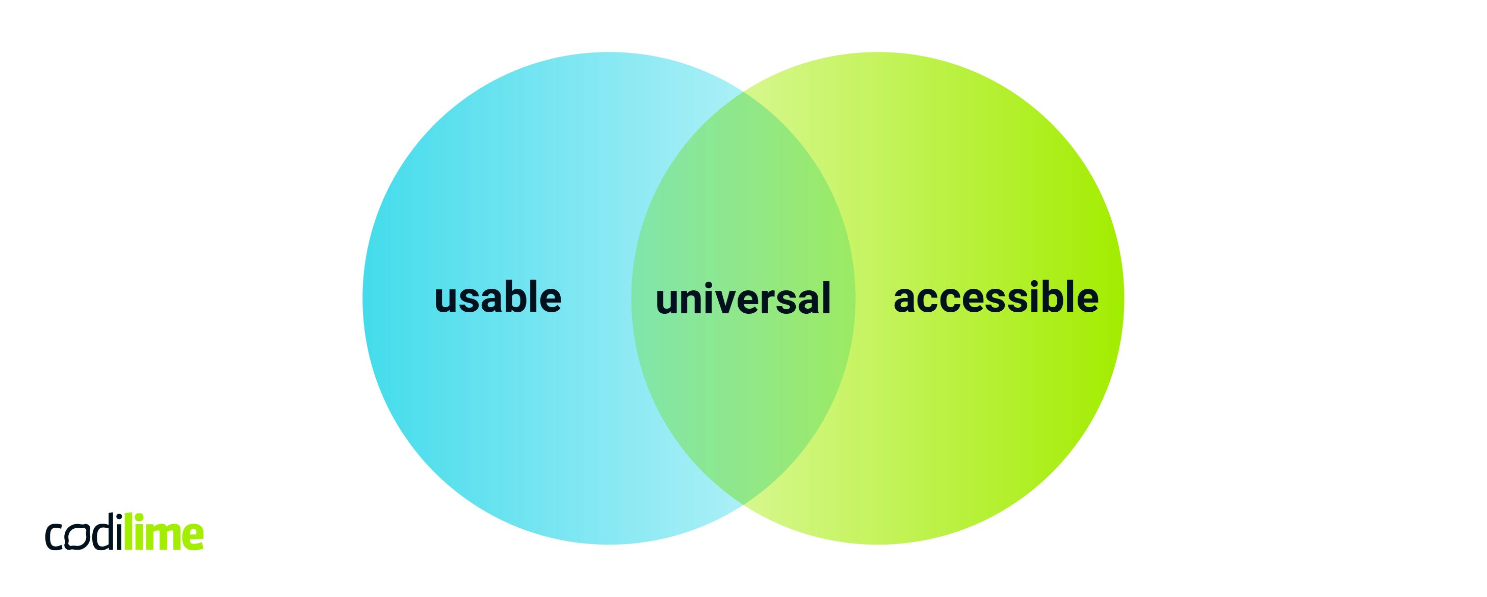
UX terminology uses different terms to describe the functionality of the product. To non-expert, accessible, universal, and usable might seem very much alike, but an experienced designer should recognize the difference. We’ve already explained accessibility in design, but what do the other two mean and how are they different from each other?

Universal design vs. accessible design
Universal design is a concept that means designing for usability and accessibility for people with different characteristics, including disabilities. Human qualities considered in universal design are age, gender, stature, ethnic background, native language, learning preference, or culture. It aims to make products usable without additional technologies for the average user and compatible with assistive hardware or software for those with special needs.
The main goal of universal design is to create products for all people – to the greatest extent possible. This concept also caters to people with disabilities – just as does accessibility design – but doesn’t solely focus on them.
Usable design vs. accessible design
Usability in products means that they are efficient and easy to use. It’s measured by a test that evaluates learnability, consistency, and efficiency. Unfortunately, these metrics often cater only to ‘average’ or ‘typical’ users. That means that even if the product is perfectly usable by them, it might not be inclusive for a person with a disability.
If you want to learn more about usability, check out our article on usability vs. user experience.
Accessibility is becoming a recognized issue among usability testers. It is complementary to the concept of usability, and implementing them both makes a product available to a larger variety of users.
Conclusion
Accessibility design is a concept that brings attention to issues designers often overlook. It is a useful tool to make interfaces inclusive and usable for users with disabilities. It is a design challenge, but it does feel rewarding to make a product or service that is non-exclusionary. Accessible websites are becoming the norm in the UX world, so make sure your software product meets the standards of inclusive design.


