The most rapidly developing organizations that operate online have been changing the way they design digital products. Famous companies like Uber, Airbnb, and others have adopted a comprehensive design system as their design standard. Gathering a collection of design components and a set of guidelines and best practices can help a company to speed up the pace of innovation within the organization.
So, what is a design system? Let’s dig into the fundamentals of an effective design system and explain why it’s worth implementing in your business.
What is a design system?
A design system is a set of reusable design components guided by transparent standards that allow teams to develop a digital product design. It’s a collection of deliverables that evolves constantly with the product, incorporating new tools and new technologies. This catalog of components is intended to define a consistent brand communication language that creates a brand identity. It defines how and why each component should be implemented. It can extend into other brand touchpoints beyond the actual product.
Differences between a Design System and a Style Guide
A design system is often confused with style guides and pattern libraries, however, it’s more high-reaching and strategic. Style guides and pattern libraries are pieces of a design system. Style guides focus on graphic styles and their usage, whereas a pattern library integrates functional components and their usage.
What is the purpose of creating a design systems
For most businesses, designers and developers, a design system is a way to save more time and effort in the long run. A design system helps streamline the workflow by giving structure and guidance while building a product. This also improves quality control processes. Having an effective design system keeps guidelines and components in one place and gives clarity on why certain decisions have been made.
Design system examples
Most design guidelines have sections such as animations, fonts, colors, grid, UI elements, and rules for creating new elements from scratch. Some practical examples of the design systems are:
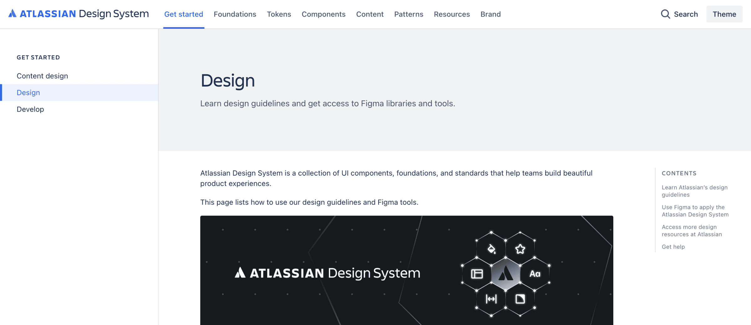
- Atlassian Design System (JIRA and Confluence) Atlassian is famous for its project management software. Their design system is a catalog of information about the tone of marketing materials, statements, as well as the use of the brand image online. The team describes their design system as ‘practical with a wink’ – it’s functional, personal, and humorous.
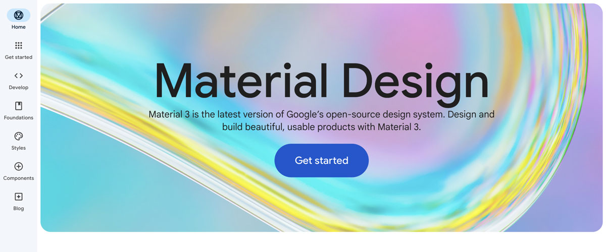
- Google Material Design System – Google has implemented a design system on a huge scale. It’s divided into sections: code, downloads, design, and components. Now, millions of websites and web/mobile apps are created using Google’s design system documentation every year.
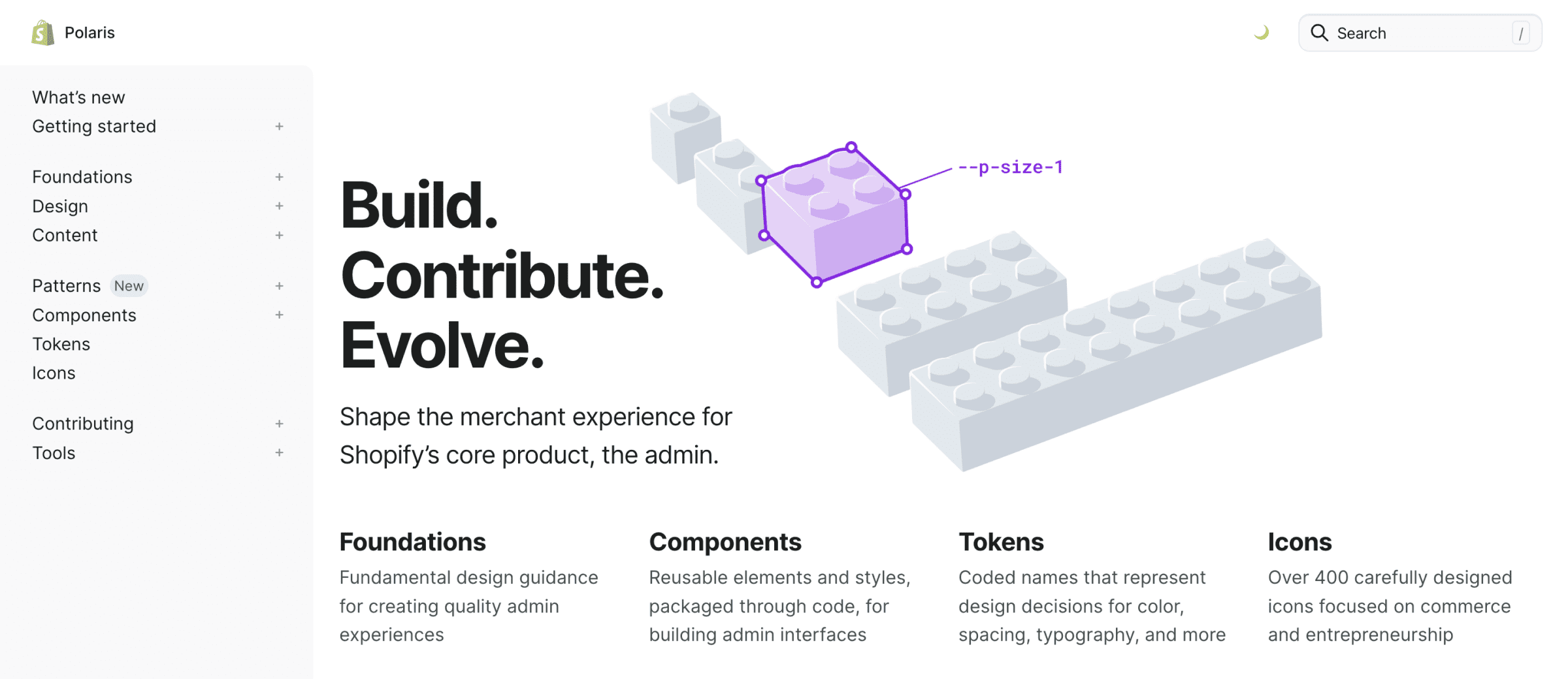
- Shopify Design System – their design system is called Polaris. It reflects the brand’s global presence. It highlights Shopify’s ease of use and scalability, as well as its focus on the experience of its merchants.
Types of design systems
Of course, not all design systems have the same standards. The type of design system you choose should depend on several factors (like the number of people who will use it, what products the system is used to build, etc.). We can consider three factors to categorize design systems:
The level of modularity
A system can be modular or integrated, as it has several interchangeable digital assets that can be combined in different ways. Some systems consist of components that can work no matter where they are installed, while others have components that require integration with other components. A modular design system includes reusable parts that suit most projects so that you can scale quickly and adapt to multiple user needs. An integrated system focuses on one unique context as components are not interchangeable.
Organizational model
The organizational model of the system can be centralized or distributed. A centralized design system reflects a team whose main goal is to build a system to be used by others. Usually, it doesn’t have biased decisions based on products the creator owns. The system covers most of the team’s needs. A distributed model has several teams that oversee the system. Designers and developers are involved so the adoption of the system is quicker. However, team leaders are needed to keep an overall vision.
The level of flexibility
The level of flexibility of a system can be strict or loose. Strict systems elaborate every single detail in their documentation. They establish all processes describing introducing new components and patterns. Loose design systems leave more space for experimentation. They provide frameworks for teams while still preserving some freedom.
Components of a design system
An effective design system can be usually divided into smaller elements:
Style guide
A style guide is a detailed document that describes all design standards: color, fonts, logotypes, and the way the brand should communicate with users. Design principles are much more important than just the visual aspect of the product. They ensure that the team understands what they are creating so that they can make more meaningful design decisions.
Pattern library
A pattern library is a graphic library that includes examples of UI elements and guidelines on how to use the UI components. Together with components, patterns are at the heart of the system. They are the instructions that allow the teams to use components logically and consistently.
UI components
UI components are a library describing the code used by developers to create the next subpages and elements. Components are used by designers, and directly in the code by programmers. They are the user interface and UI components that make up the heart of the design system. They minimize the effort required to build a new product.
This all makes up a design system, an organized structure. However, the system also includes purpose and shared values (the answer to the questions: Where are we going? Why? How?). It’s incredibly important to align teams around transparent goals. This will ensure people work in the same direction.
To manage design systems, brand identity and proper language should be also defined. They should be in line with the general strategy and the business objectives. Finally, a design system includes a set of best practices that helps the team to form and develop their technical skills. All these elements should be included in the documentation that describes the system itself.
What tools are used to create a UX design platform?
There are many UX design tools allowing internal teams to manage design elements. Let’s dive deeper into the most popular UX designer tools:
Figma
Website: figma.com
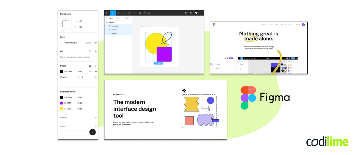
Figma is a great and flexible platform for graphic, UX/UI design, as well as wireframing. The app is web-based so all you need to use it is access to a web browser, however you can also utilize it as a desktop application. Figma enables multiple designers to work on projects in real time in the easiest possible way and outclasses the competition’s solutions regarding real-time collaboration. It also improves and facilitates cooperation between UX designers and developers and copy creators which means the full design and development process can truly be conducted in an iterative and agile manner. This tool also offers numerous tutorials for design basics. Figma is CodiLime’s UX team’s weapon of choice, along with Sketch and Adobe XD.
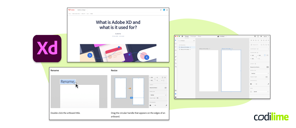
Adobe XD
Webiste: adobe.com
Adobe XD is a comprehensive platform to create design systems (colors, character style, components, and more). You can quickly share your work with others and collaborate in real time. All digital assets available from Adobe’s cloud can be easily used in other Adobe products (Illustrator, Photoshop, Adobe Creative Cloud apps).
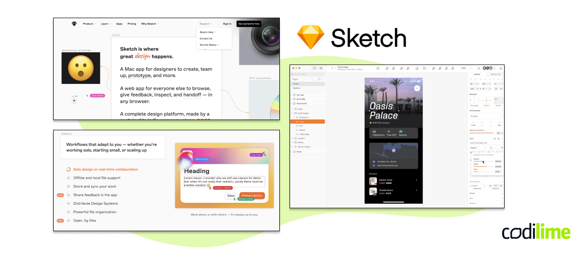
Sketch
Website: sketch.com
This is a comprehensive, all-in-one platform for digital design. It is mostly used for collaborative design tools, prototyping, and developer handoff. Sketch has been the application of choice for many UI and UX designers because it’s a professional, yet intuitive and easy-to-use platform.
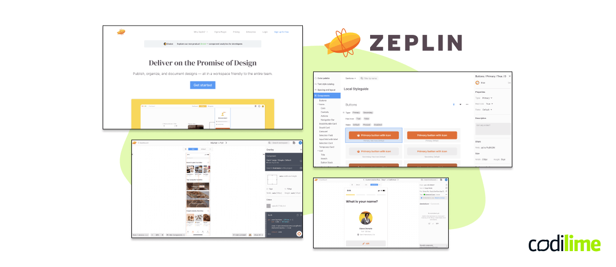
Zeplin
Webiste: zeplin.io
A plugin and application designed to find a common space between engineers and designers. It exports designs from Sketch, Figma, Adobe Photoshop CC and Adobe XD into a format which generates code snippets, assets, and design specs.
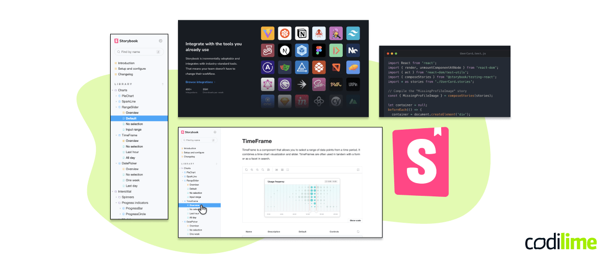
Storybook
Webiste: storybook.js.org
Storybook is a frontend workshop environment tool for developing UI components in isolation for React, Angular, and Vue. It even allows you to design and build full screens. Thanks to Storybook, building amazing user interfaces is efficient and organized. Recently, a dedicated Figma plugin has been added to the toolkit.
Adobe CC
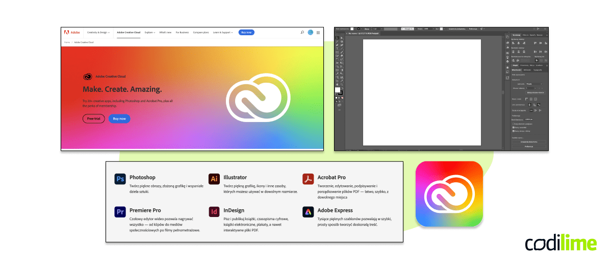
Webiste: adobe.com/creativecloud.html
Adobe Creative Cloud is a set of Adobe tools among which you will find Adobe XD, but also Photoshop, Illustrator, InDesign, After Effects, and many many more. The package covers almost everything a UX designer would need for their work.
Affinity
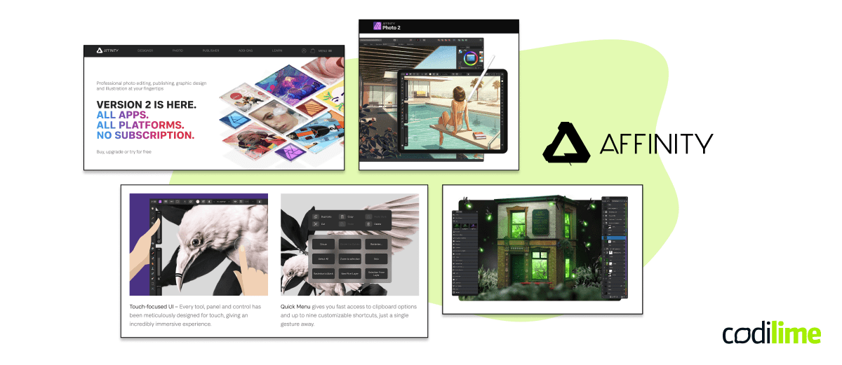
Webiste: affinity.serif.com
An alternative to Adobe that is much more affordable, and the level of performance is just the same. Affinity is professional software for designers that allows them to create high-quality designs.
DaVinci Resolve
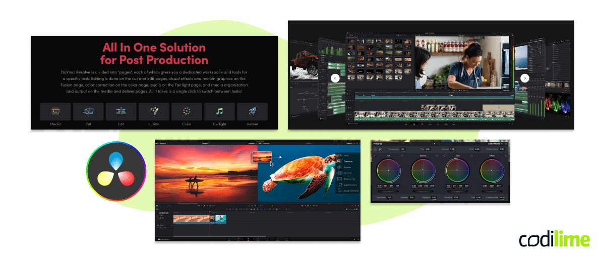
Webiste: blackmagicdesign.com/products/davinciresolve
When it comes to animations, this is our favorite tool. It enables editing, creating visual effects and motion graphics, color correction and auto post-production. This powerful app is a great all-in-one solution.
Business benefits of investing in design systems
The same way UX design is important for your product, there are multiple reasons and benefits awaiting for you if you decide to create your own design system.
You save time

The process of development is speeded up. Sure, creating a design system requires time but it’s an investment with long-term benefits. The documentation is available for all the teams and is easy to find. The faster development process means a faster time to market and more agile releases and deployments.
Better teamwork

Designers and developers work better together – the teams are kind of forced to systematize their work and to think in components. They start speaking the same language and solving problems together. A design system gets everyone on the same page. Everyone in the team understands what they are working on and the resources they have at hand. Everyone has access to the documentation to help get familiar with the project.
Consistency

If you want to build effective products, consistency is vital. Design should be predictable, easy to understand, and intuitive – in short, it should be consistent. Thanks to creating a design system, you can achieve:
- Visual consistency - ‘design language’ is visible in sizing, colors, fonts, etc.
- Functional consistency - people who use your digital product get the outcome they would expect when using it. This makes users feel safe and familiar with the product's accessible design.
- Internal consistency - users can focus on actions instead of putting effort into learning the UI components and how the actions should be carried out.
- External consistency - the same UI elements can be reused across different platforms.
Lower costs

Design debt is reduced – if you build for limited use cases to cover short-term issues, you eventually accumulate obsolete components. They require maintenance which can lead to design debt. A design system means building components that can be used across different applications instead of creating elements for a specific use case.
Conclusion
The idea of a design system has been introduced to optimize and improve design efforts and promote consistency within the team. Now, many companies don’t even start building new products without using their comprehensive design systems that speed up their software development lifecycle. It’s the only way to scale design and educate team members. Finally, it allows designers to deal with more complex UX and UI issues.


