


Have you ever heard of the so-called masonry layout, as seen on Pinterest? In short, it consists of elements of unequal size stacked one after the other in the direction of the line. As they move to the next line, the items will move into the gaps left by the smaller items in the previous line. Preparing this type of layout is not a simple task.
In 2010, David DeSandro implemented the 'Masonry' library to create this type of layout (Masonry library  ). However, the implementation of this layout is pretty complicated. You need to spend a fair amount of time to figure out how it works, and how to configure and adjust it to make it work as expected.
There are several options for creating this layout using only CSS. One of them is the use of the grid layout, and that is what we would like to focus on in this article. We will go through some great CSS container queries, which can be used in a masonry layout, and show how to create an emergency exit for web browsers that don’t support it yet (caniuse ).

How to build a grid layout with CSS Masonry
In May 2020, the ‘masonry’ property was added to level 3 of the ‘CSS Grid Layout’ specification for ‘grid-template-columns’ and ‘grid-template-rows’. Only Firefox offers support when the appropriate flag is activated. But it's worth investigating anyway as it's surprisingly easy.
Below you will find a walk-through for a simple configuration.
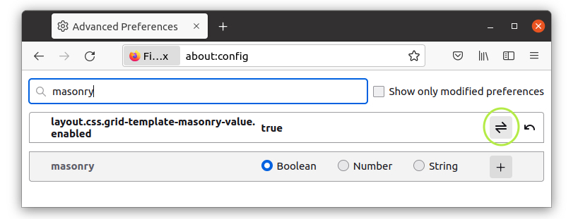
Step one: activate the flag
To activate the above mentioned flag, we need to go to ‘about: config’ in the browser and then enterthe value, ‘masonry’. This causes the ‘layout.css.grid-template-masonry-value.enabled’ flag to be displayed, which we turn on by clicking the button with the two arrows on the right.
Step two: create an HTML structure
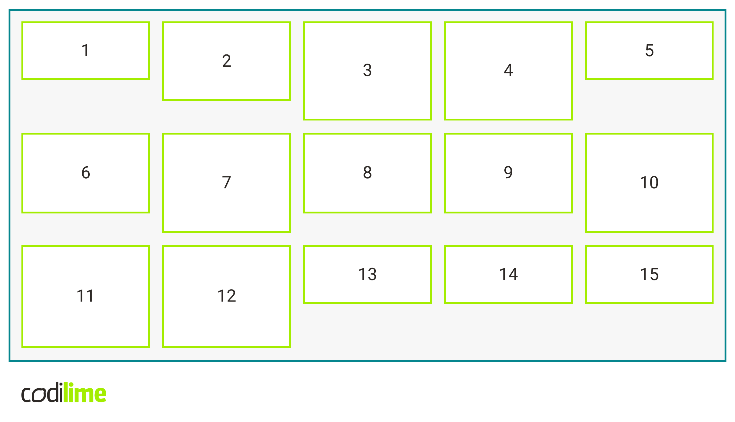
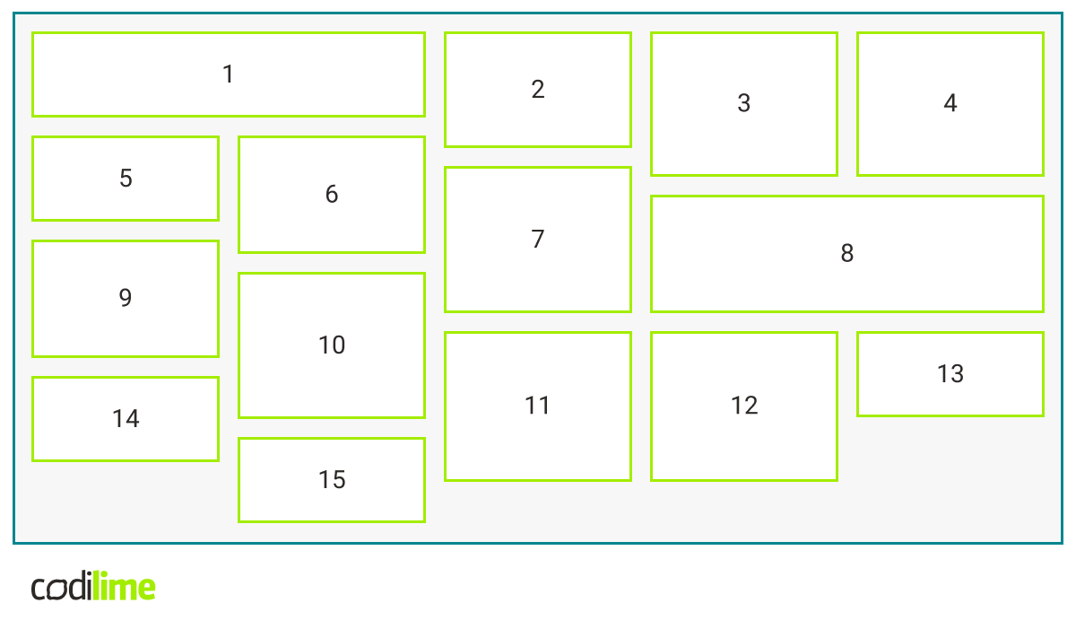
To start with, let’s create a simple HTML structure with a class of grid on it that contains the necessary boxes. Each of them has a different height so you can see how the masonry layout works.
.grid-layout {
    display: grid;
    align-items: start;
    background-color: var(--grey);
    grid-template-columns: repeat(5, 1fr);
    width: 700px;
    gap: 10px;
    border: 2px solid var(--blue);
    padding: 10px;
    margin: 20px;
}

.item {
    background-color: var(--white);
    border: 2px solid var(--lemon);
    display: flex;
    justify-content: center;
    align-items: center;
}
Step three: play with the magic masonry property
So far, we are still missing the most important line of the code, where the real magic happens.
.grid-layout {
     /*the rest of properties without align-items: start*/
     grid-template-rows: masonry;
}
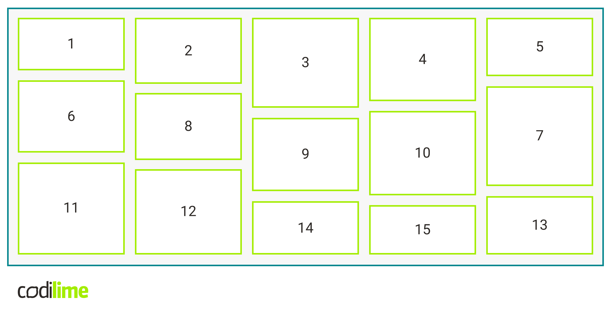
Take a look at the difference - all the gaps are gone with this key line added!
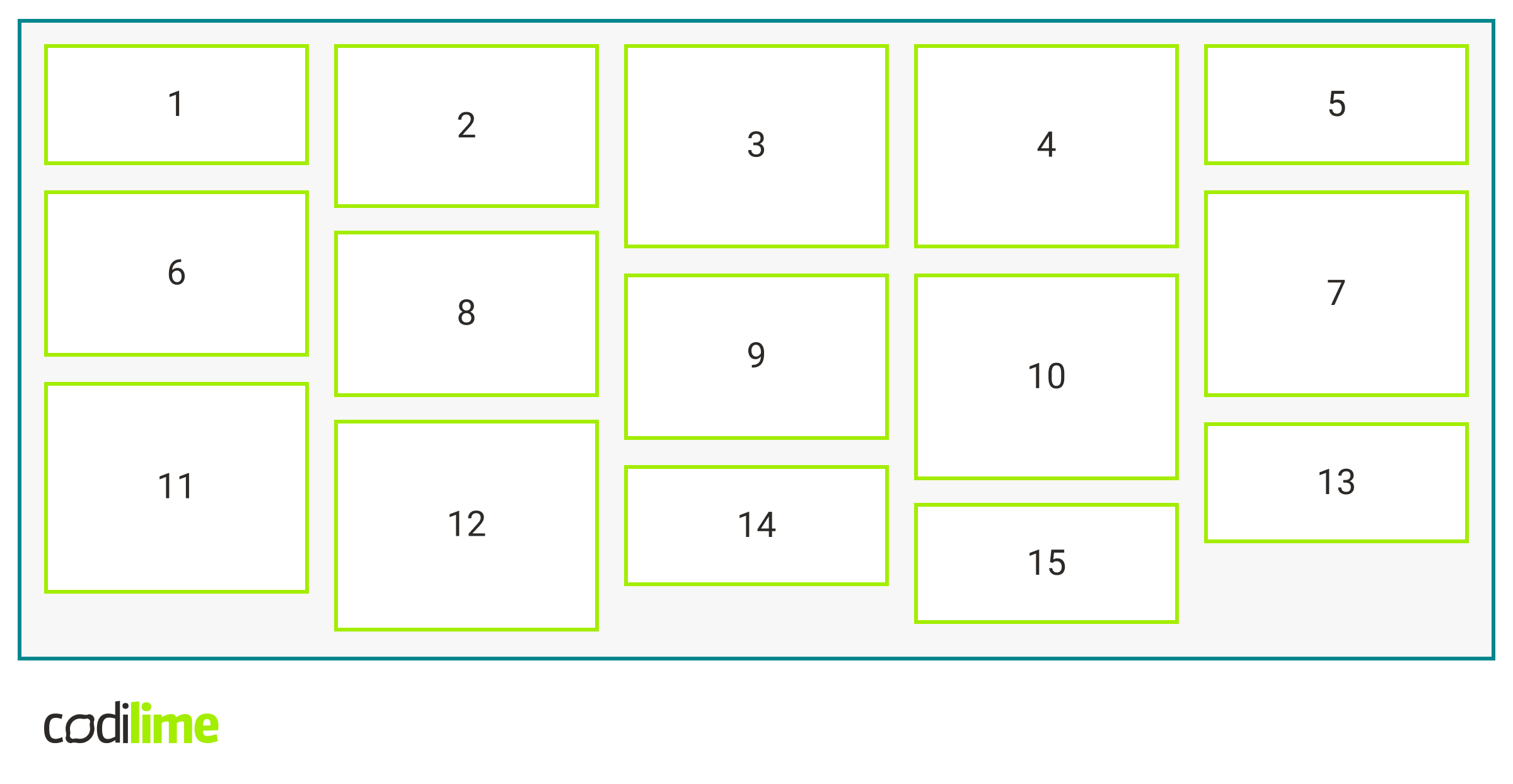
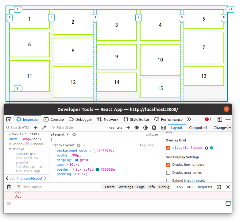
We can go to the grid inspector where we can see that our grid has the content in five columns and no rows. The elements of the columns are compressed to fill all the available space. As you can see, it's child's play and it really works!
Let's go further and try to edit our layout a bit. One of the options is to make several boxes wider. We can try to do it by adding the following class to them:
.large {S
    grid-column: span 2;
}
Another thing we could modify is the empty spaces below. To achieve this, we can add a property to our grid `align-tracks:stretch`:
.grid-layout {
     /*the rest of properties*/
     align-tracks: stretch;
}
Workaround for browsers other than Firefox
We would like to offer a workaround for browsers other than Firefox to enable wider use of the masonry layout. For browsers that do not support masonry, we can use ‘columns’ and set the following property for internal items to avoid breaking inside.
.grid-layout > * {
    break-inside: avoid;
}
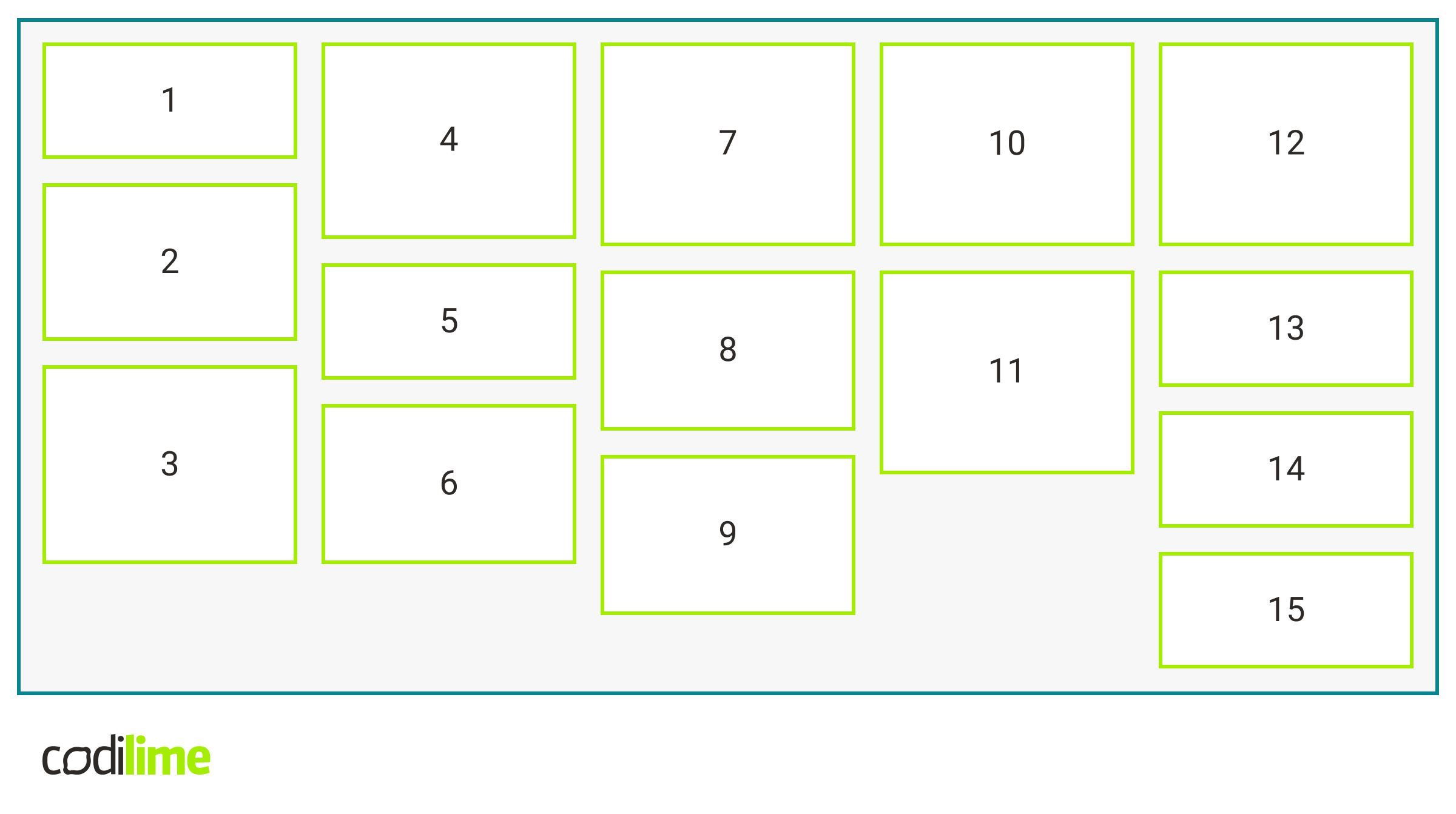
In this case, the order of things is a little different. The boxes are placed from top to bottom, unlike in the case of the previous masonry layout where the boxes were placed from left to right.
Final code implementation
The code created while writing this article does not seem too complicated:
.grid-layout {
    background-color: var(--grey);
    width: 700px;
    columns: 5;
    gap: 10px;
    border: 2px solid var(--blue);
    padding: 10px;
    margin: 0 auto; // change margin for non supported browsers
}

.grid-layout > * {
    break-inside: avoid;
    margin-bottom: 10px; // change margin for non supported browsers
}

@supports (grid-template-columns: masonry) {
    .grid-layout {
        display: grid;
        grid-template-columns: repeat(5, 1fr);
        grid-template-rows: masonry;
        align-tracks: stretch;
    }

    .grid-layout > * {
        margin-bottom: 0; // reset margin
  }
}
Summary
In this article, we touched upon the extremely interesting topic of masonry layout. If this short article has stimulated your appetite for more, we encourage you to undertake further exploration of the topic on your own. Good luck in your adventure of learning about the masonry layout!


