


A front-end developer spends time adjusting CSS to the app they are working on, how much time depends on the specific project. Many people assume this is the easy part. I thought so too, but now I think I was wrong.
CSS, or Cascading Style Sheets, is a style sheet language that focuses on the presentational part of the layout.
Some people enjoy it, some even love it, but there are people who avoid it at any cost and try to focus, for example, on JavaScript logic instead. There are times that I feel like I belong to both groups.
So what is with those container queries and why is this such an interesting topic? Container queries are nothing new, and probably many front-end developers have already heard about them. I have been thinking lately, what is the current status of this feature?
Responsive web design with a different approach?
I assume you are familiar with @media queries. For many years this was a solution to building applications for different devices. Is there something wrong with @media queries?
Not at all. So, why was a new option put on the table if the previous solution did its job?
With container queries, we can think about responsive web design (RWD) slightly differently than with @media queries. Now, styles can be modified to elements not based on webpage width - viewport size, but on the parent container width.
This card is the same component three times. The difference is inside – the three distinct elements - sections in this example have different style properties. To achieve this with @media we would need to add classes or to know how containers work internally within the @media ranges and write CSS to cover it.
It’s easier to handle it with @container. Instead of checking the viewport size, we focus on the container size and modify the card with CSS based on that.
To make it work, we should download the Canary version of Chrome found here  and enable the flag here chrome://flags/#enable-container-queries. This flag is also available in standard Chrome, as well as the Canary version, but it does not always function immediately after enabling it.

How to use it?
The flow is similar to media queries – @container also uses breakpoints although the target is the parent container. One important difference is that it must be implemented in two parts.
First of all, we have an option to apply a container-type property. This defines the element as a query container! Elements inside this container can query for size, layout, style, and state. In the short term, we can now target not only the viewport with @media queries but also this query container's own properties, like width.
section {
  container-type: inline-size;
}
We will use the option inline-size in our example. If you want to know more, check out the other possibilities of CSS container types . It applies to contain: inline-size layout style by default - if you want to know more about contain, take a look here .
In addition, the container name can be specified to target it later with @container syntax.
section {
  container-type: inline-size;
  container-name: CodiLime;
}
There is also a container property that is a shorthand for container-type and container-name, but I was not able to make it work in the sandbox.
With this first step applied, we have defined our containment context. We can now move on to style our card component.
@container CodiLime (min-width: 400px) {
  .card {
    // styles
  }
}
As I mentioned, the syntax is familiar to @media queries. In the code above, we will apply styles to the .card element when the section element has at least 400px.
We can apply multiple queries with different breakpoints, and all the styles inside the @container will be applied when the condition is truthy.
Let's see an example
Let's create an example as a possible use case. I want to have three sections (containers) with the exact same card component inside. I will create a grid layout with three columns. By default, all of my containers will use the full width of rows. When the viewport is bigger than, let's say, 1000px, I want the first section (container) to cover 2/3 and the second section (container) the remaining 1/3 of the first row. The third section (container) stays the same, covering the full next row.
main {
  display: grid;
  grid-template-columns: repeat(3, 1fr);
}

section {
  grid-column: 1 / 4;

  container-type: inline-size;
  container-name: CodiLime;
}

@media (min-width: 1000px) {
  section.one {
    grid-column: 1 / 3;
  }
  section.two {
    grid-column: 3 / 4;
  }
}
Currently, based on the user device or the browser's width, our layout changes. So what can we do with @container for a better UX experience?
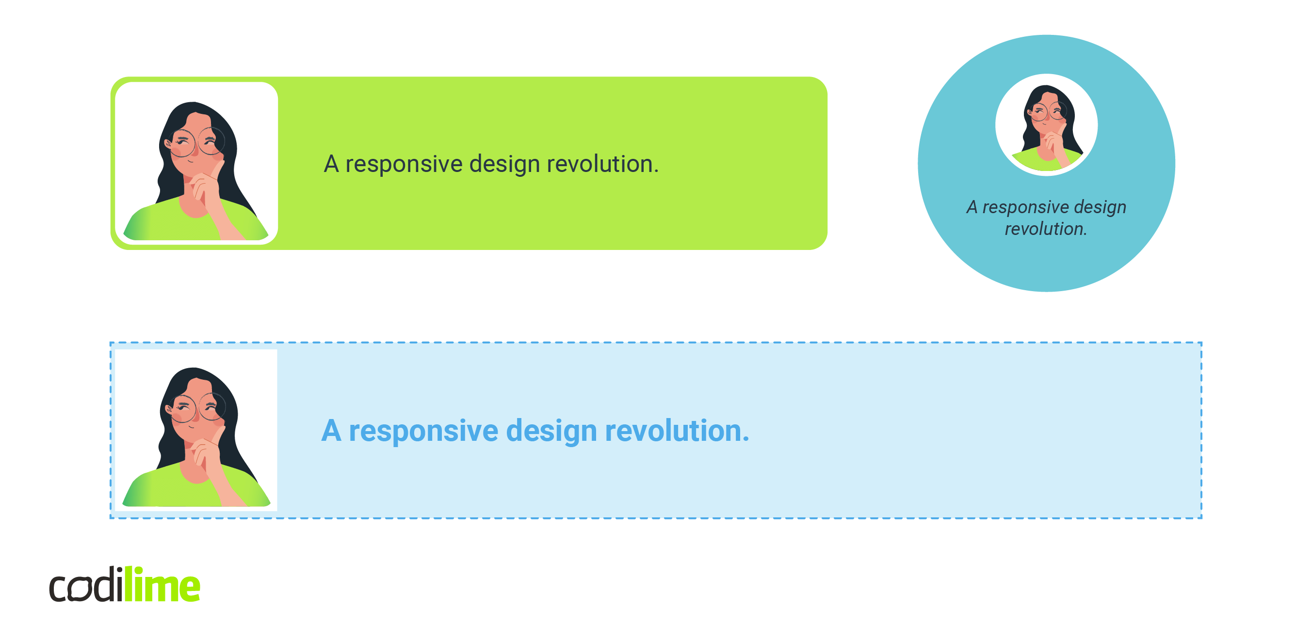
I have created a simple card component, nothing fancy. It has an image and some text inside.
<div class="card">
  <img loading="lazy" src="./codiLime.png" width="300px" height="300px" />
  <h2>A responsive design revolution.</h2>
</div>
I styled it for a more light blue feel, changing the image and text inside slightly.
.card {
  display: flex;
  align-items: center;
  gap: 20px;
  background: #d3eefa;
  border: 2px dashed #4dabe9;
  padding: 5px;

  h2 {
    font-size: 30px;
    font-weight: 700;
    color: #4dabe9;
  }

  img {
    background: #ffffff;
    padding: 5px;
    width: 150px;
    height: 150px;
  }
}
Nothing new so far, but how about using our @container property? When our section shrinks for whatever reason, I want the card component to render differently. In my case, when the section is below 750px I want it to use a green color palette.
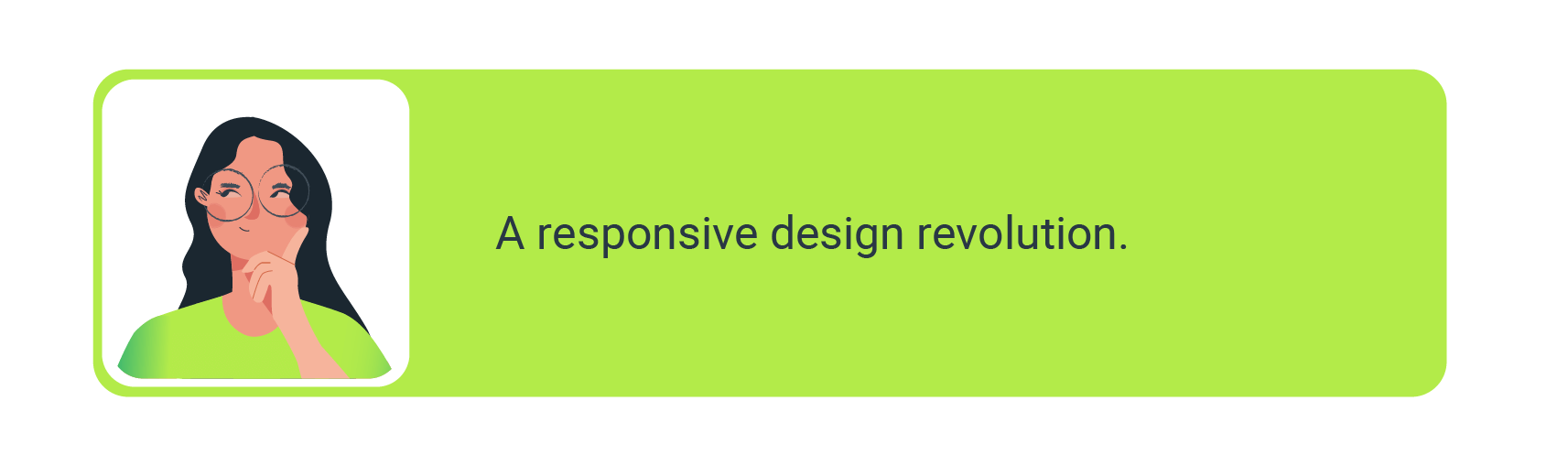
@container CodiLime (max-width: 750px) {
  .card {
    background: #b3eb49;
    border: 1px solid #b3eb49;
    border-radius: 20px;
    padding: 5px 70px 5px 5px;

    h2 {
      font-size: 24px;
      font-weight: 400;
      color: #243749;
    }

    img {
      border-radius: 20px;
    }
  }
}
The only thing needed was to set the max-width: 750px on CodiLime @container and everything adjusts automatically. For better visualization, I've created another, third option for when our section is even smaller, less than 400px: a round card for mobile devices or maybe aside content.
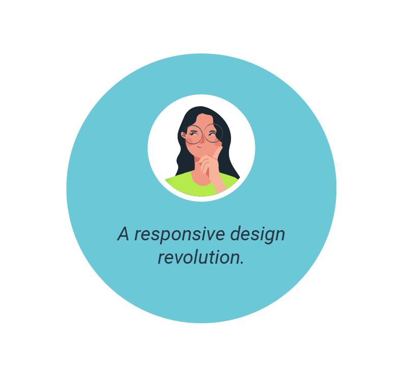
@container CodiLime (max-width: 400px) {
  .card {
    flex-direction: column;
    justify-content: center;
    margin: 0 auto;
    background: #6ac8d7;
    border: 1px solid #6ac8d7;
    width: 200px;
    height: 200px;
    padding: 10px;
    border-radius: 50%;
    gap: 5px;

    h2 {
      font-size: 16px;
      text-align: center;
      font-style: italic;
    }

    img {
      border-radius: 50%;
      width: 80px;
      height: 80px;
    }
  }
}
Let's see what we have accomplished with the code above. When we start with 1000px width, we see all three kinds of card component. Reducing the width will cause our layout to change, and all containers are full width.
All our cards now have enough space for the first blue wide style! Shrinking it further will modify all of them to the green option and then the round version.
But what if we start from the 1000px and expand the width?
First, our green card will have enough space to be blue, and later, the circle card will become green! I think now you can figure out what will happen when we expand it even more. Check what happens above 2330px if you are still not sure.
When to use it?
It can be beneficial if we have conditional renderings of containers. When a container can change its size dynamically, for example, based on user events, this could be an elegant way to ensure the proper styling inside.
If you want to play around with it, check out my playground .
>> If you're into JavaScript, might want to read about Angular state management.
Summary
CSS container queries are an interesting option, but we still need to wait a while until we can use it in production.
It's still in development, so how @container will work in the future may change.
The World Wide Web Consortium – the standards organization – accepted an initial draft from the Oddbird developer, Miriam Suzanne. Then it was moved to the official specification here .
At this moment, the CanIuse website clearly shows that no browsers support this feature at the moment.
Overall, it will be a nice addition when it is available and I am looking forward to exploring it further, as I probably have not identified all the possible use cases while playing around with it so far.
See also >> How to Build Masonry Layout in 5 Minutes.


