Most people who are involved in IT in one way or another know that UX is an essential aspect of any product. There are many different aspects to UX but probably one of the most important, but quite underestimated, is the proper use of color in design. In this article, we will delve deeper into the role of color in UX.
What is color?
We will start with the basics.
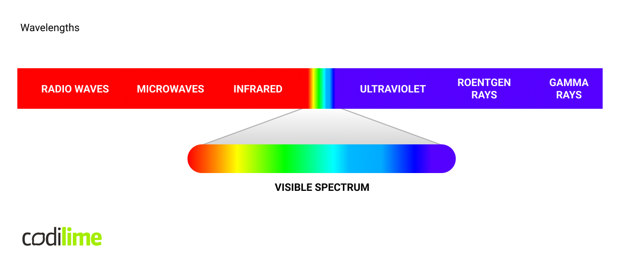
Color perception is a solely subjective psychological reaction happening in the brain of the viewer. In physics, we can only talk about a tiny section of the electromagnetic radiation spectrum. It reaches the viewer usually as a mixture of wavelengths, so the same color can be achieved by different combinations of volume and different frequencies. We can see that pink does not exist on this scale and is a perfect example of a mixture of different wavelengths reaching the eye.
Now, let us imagine bending this strip to create a ring.
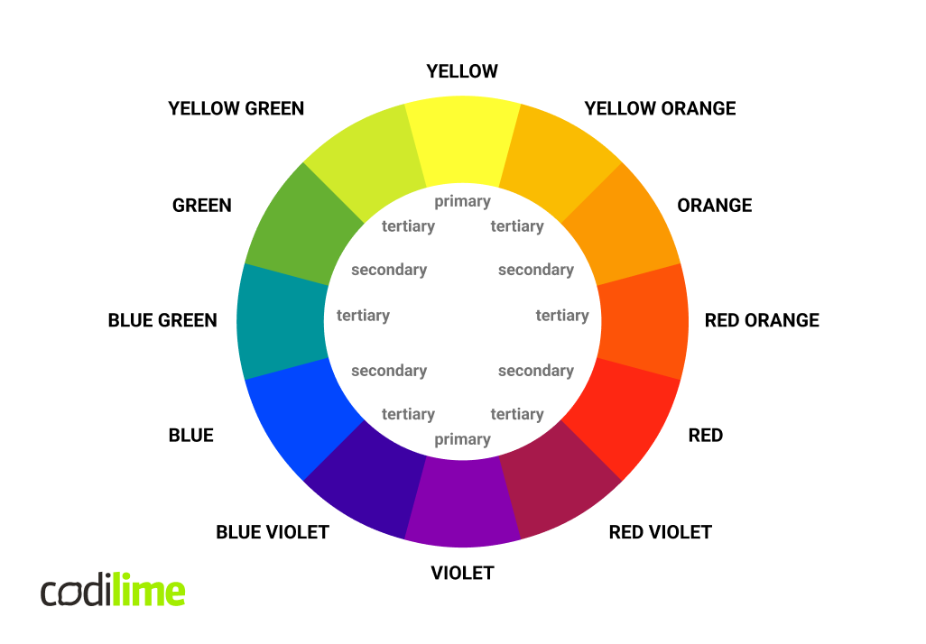
That is how we create the color wheel - the theory on which this color wheel is based has been created by a German physiologist, Ewald Hering. The primary colors are red, blue, and yellow. If we combine any two of these colors, we will create secondary colors that create the main spectrum. The tertiary colors are hues created by mixing both primary and secondary colors. It is worth mentioning the concept of complementary colors - these are the opposites on the wheel. In the traditional RYB color model, the complementary color pairs are red–green, yellow–purple, and blue–orange.
But, these are only colors in their full saturation, also referred to as chroma, which should be a second dimension to color options. If we build on the concept, utilizing another, third dimension to cover luminance, we get the full spectrum of possibilities.
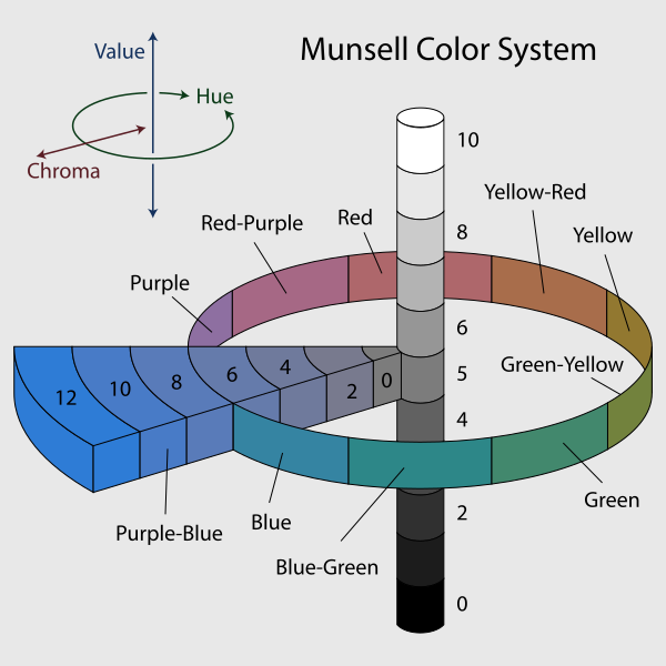
To summarize the vocabulary used:
Think of hue as the vibe or essence of a color. It's like asking, "How much does this color feel like red, orange, yellow, and so on?" Chroma - That's the colorfulness factor, how much a color pops based on how bright it is compared to a white background. It's basically about how colorful something looks compared to white. Lightness is how bright or dark something appears. It's like judging if something's lighter or darker than something else under the same lighting conditions.
Now, let's talk about mixing it up.
Ever heard of tints and shades? Tints are when you mix a color with white, making it lighter. Shades, on the other hand, involve mixing with black, making it darker. Both play with how saturated the color ends up. And tone? That's what you get when you mix a color with gray or do a combo of tinting and shading. Mixing with gray tones down the colorfulness but keeps the hue intact.
In general, the spectrum with which we can work with is very broad, one color can have a multitude of variants, from dark to bright, highly saturated to toned down. One thing to keep in mind, though, is that white and black are not colors - they do not carry any hue. Furthermore, there is no such thing as a perfect white or perfect black - that’s why, as an example, we use Kelvins to discern types of white light - but this is a topic for another conversation.
Print & display - the difference explained
Now let me shine some light on color synthesis, or mixing, in other words. It can be achieved in two ways - additive and subtractive. The former “starts” with black, and by mixing the three primary colors, we get white, while the latter adds three colors on top of white to create black. We need to point out a big difference here, though - additive uses red, blue and green colors, while subtractive works with yellow, cyan and magenta.
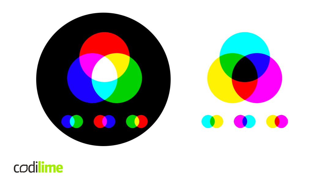
And that is why RGB and CMYK color systems exist. The RGB is used for light-emitting sources, displays, projectors and so forth. Cyan, magenta and yellow on the other hand are the basics of the printing system. The K in CMYK actually refers to “key”, or “key plate” which is an old-school printing term, referring to the printing plate that would contain the most detail, which was most often the color black.
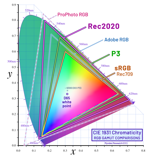
We are focusing on the RGB side of things in this article. CIELAB or CIE L*a*b* is a color space that expresses color as three values: L* for perceptual lightness and a* and b* for the four unique colors of human vision: red, green, blue and yellow. While the LAB space is not truly perceptually uniform, it nevertheless is useful in industry for detecting small differences in color. We tend to see those when judging the quality of displays. Most monitors produced these days cover the sRGB spectrum by 100%, and we tend to use that as a standard when designing interfaces.
How to choose from billions of colors?
When we are working as a designer and we need to choose the right colors, we usually start with a single main choice that will drive the rest of the design, and we build upon it, expanding towards other warm, cold or neutral hues. Palette can be monochromatic - just slightly changing the shades, tones or hues, while still moving around a single color. It can also be polychromatic - using different chromas. It could also use quite different sets of colors, for example to create a kind of shock for viewers.
Color helps us in defining the meaning of each element of the interface. It informs, or even enhances the contrast between the interface sections. Color in an interface is a multidimensional element - visual identity plays an important role in this regard, but the most important of them all is to create a contrast between each element, giving them meaning.
Let’s take a quick look at color meanings:
- Red is radical. It is extreme, representing passion, energy, fire, violence, and anger. It is vibrant and creates contrast, demanding the viewer’s attention. Designers use red as a loud shout.
- Orange is a color that is especially subjective. Orange has the positive attributes of heat, energy, youth and happiness. It is related to summer sunsets and the color of flames in a fireplace. It is used to create a sense of immediacy and spontaneity and may be negatively seen as loud or annoying.
- Yellow is universally regarded as cheerful, representing happiness, sunlight, optimism, and creativity. Yellow can be used to create a bold contrast with other colors. It works well as a replacement for gray when the goal is vibrancy.
- Lime is a bold color that verges on neon. It communicates boldness, youth, vitality, and creativity. Unlike mid-range green and its connection to nature, lime is less restful. It suggests confidence, prosperity, travel, and growth. Negative connotations are sickness, disease, jealousy, and envy.
- Green communicates nature and the environment. It is also the color of money, regardless of a country’s own currency design. Green can also communicate illness or decay. Green can be used as a design element to calm warm colors, such as orange or red. This, however, needs to be monitored, as the right tone of each will create an optical vibration.
- Light blue is a color of power. It can communicate mature military authority on one end of the spectrum and juvenile innocence on the other. It communicates ideas of peace and quiet, the spiritual and infinite, it is calming and reassuring. Like yellow, light blue is a good substitute for gray if the designer wants a more colorful solution.
- Blue - if asked, most clients will suggest it for a logo color. It projects honesty and loyalty. Blue is associated with the sky and water, power and authority. It can feel rich and hypnotic, or it can become banal and invisible, depending on the application. Alternatively, blue can be surprising when used dramatically and unexpectedly.
- Purple - due to its usage by royalty, Eastern religions and Catholicism, it carries the connotation of spirituality and aristocracy. If purple contains more red, it will be warmer, brighter and more intense. If it contains more blue, it will have a cooler and calmer effect. With its connection to religion and politics, it can be polarizing.
- Pink has definite feminine connotations. It communicates romance, compassion, innocence and fragility. Used for baby girls’ rooms and clothing, it has gender connotations that have been questioned for the last fifty years. It is, therefore, a politically charged color.
Each culture has its own way of interpreting color - Western and American views can be vastly different from the perception of Far East cultures as an example. We need to be wary of these differences while designing for a global audience.
User Interface and the experiences it creates
Let’s talk about the “experience” first. All products and services that we use create some kind of reaction - usually an emotional one. These emotions can range from pleasure, satisfaction, and confidence but could also be frustration, helplessness, or irritation. All people are part-time designers - we design things in such a way to reach goals that interest us - using words, people, objects that we choose, or even the way we use our time. Each one of us is trying to solve their problems in their own way. Some of us might not know how to create a good design, but most can tell when the design is bad or ugly.
User experience is the deep understanding and prediction of needs. One needs empathy to achieve it - understanding how a specific person thinks, how they feel. UX designers need to ask themselves “Why do people think, feel, or do things this way, not the other?”.
Color can trigger specific emotions in the observer and it is used with full premeditation in politics, marketing, but also by the interface designers. The color contrast can be created not only on the hue level, but also lightness or saturation. As an example, black and yellow are a notoriously strong contrast and they are accordingly used to warn observers; used as road signs, warnings and each time we want to bring maximum attention to our communication.
The solid foundation of each interface comes from the design system, the library of all the elements used, that way, we achieve coherence and uniformity - all things just fit together nicely. The color palette is one of those elements that form the foundation of the interface. Thanks to this, we can assign specific colors to its meaning and use so that designers can produce cohesive views fast and easy - if we’ve got a recipe, making a great dish is that much easier! But we need to make sure that we use these consistently.
Design systems these days use color to inform hierarchy within the interface, where a single color can be used to easily create a list of colors that will be used for all the surfaces and elements within the UI. The Material Design system is a great example, as choosing a single color on its website generates a full range of colors to be used. This is exactly how design systems create elegant and cohesive design language, which in turn helps the users to navigate the application. Let’s imagine that we are working as a designer and we need to select the right colors for the interface. A great starting point would be to use exactly these systems, like Carbon, Material, or Apple Human Interface.
IBM’s Carbon Design System has a great example for a status palette, where we see each color that can be used for that purpose. These color values are Carbon-specific, but if we change the shades slightly, the general rule of thumb stays the same. In general, red is used to evoke danger or failure, orange is a serious warning, yellow is a regular warning, while green represents “normal” or “success”. Blue is usually a passive information, with additional info or progress of the workflow. On the other hand - these are just colors, that can be viewed by multiple users with color vision deficiencies and it means, that at the end of the day, the contrast will decide whether it is readable and conveys the information - which is the main goal that we want to achieve.
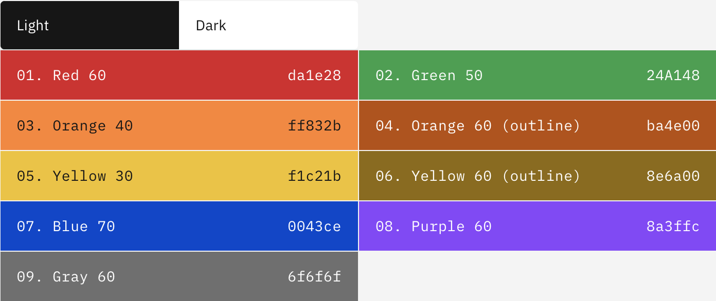
Additionally, Carbon extends its palette to gray and purple - the former used for drafts or jobs that have not been finished, while the latter symbolizes elements that are out of the ordinary or unusual, or just undefined.
Example 1:


Example 2:

Now, I will quickly mention a very cool procedure used in interface design at a very early concept stage. To make it easier for the client - or a potential client - to focus on the essence of the interface, during the initial prototyping and building of the information architecture, the use of any colors is deliberately omitted, and the so-called prototypes are produced in black and white, in an extreme situation with a touch of gray. The things we mentioned earlier about the color function in interfaces can interfere at this early stage, they can make work more difficult instead of easier because someone may focus on the tone or contrast of the color, and we only want to focus on the architecture, or the basic functions. This is the behind-the-scenes activity of a UX designer - this initial stage of design is used to build a good foundation, on which we will only then start building a useful interface. Therefore, if you see a black and white prototype, it is not because the designer did not have enough time to add some color!
Usability and WCAG explained
First, let's talk about accessibility - it can be viewed as the "ability to access" and benefit from some system or entity. The concept focuses on enabling access for people with disabilities or enabling access through the use of assistive technology; however, research and development in accessibility brings benefits to everyone, even those not affected in any way.
The Web Content Accessibility Guidelines (WCAG in short) define how to make Web content more accessible to all people - whether it’s a user with disabilities or without any. Accessibility guidelines take into account a wide range of disabilities, including visual, auditory, physical, speech, cognitive, language, learning, and neurological. We could liken it to a wheelchair ramp, but when it comes to interfaces, this topic revolves around problems with interaction with devices or programs, color blindness being a prime example.
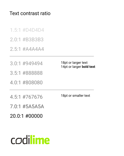
Contrast is one of the main evaluation points when it comes to accessibility. WCAG defines three levels of conformance in order to meet the needs of different groups and different situations: A (lowest), AA (mid-range), and AAA (highest). To meet the AA standards for text, 4.5 is a safe ratio for any text, while 3 to 1 is acceptable for text larger than 18 pt. 3:1 should generally be the lowest contrast we should not go below, even when designing for people with no disabilities.
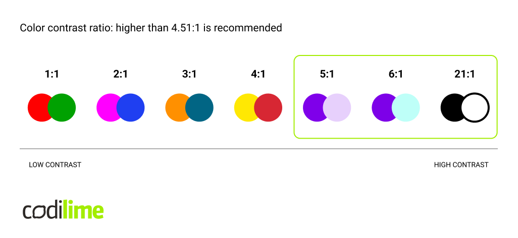
When we switch to colors, we can see that red and green are a bad pairing as they create no contrast, they only start to contrast when we use lightess to discern them. Of course, nobody is going to create a purple button on a dark blue background - firstly, because it will probably be not pleasing to the eye, but secondly, it will never be readable. That is why understanding the difference between hue and lightness is so important.
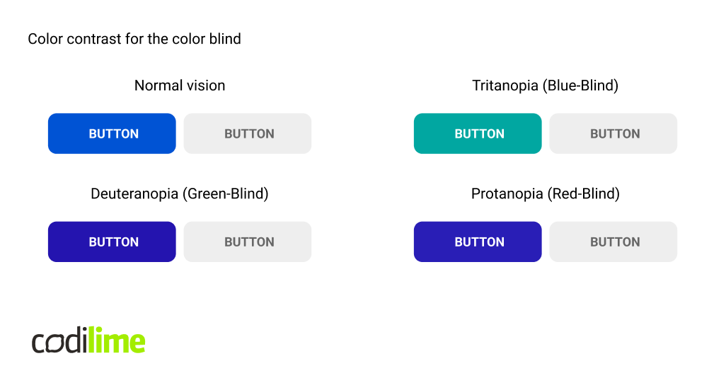
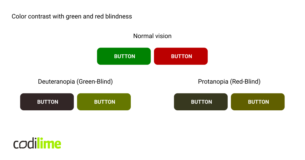
This is a good example of how normal colors, for people without any color blindness, will differ from those viewed by those with different disabilities - protanopia, tritanopia or deuteranopia. On the left, a comparison of two completely different approaches, where only one of the buttons is in color, its background is very dark, and the other button is in light gray. On the right, there are apparently two very different buttons, because there are no colors that contrast more than green and red... but for people with a disability, they can appear nearly identical. We also have to take this into account when designing, and simply saying "I want it in a different color" may sometimes be blocked by the need for such an approach.
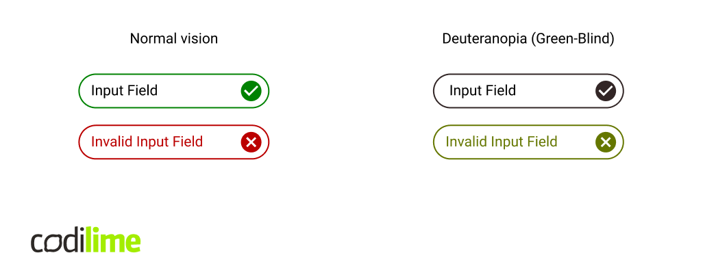
Here we have another example with green and red. For better accessibility, it is sometimes worth using additional elements, such as icons. Although - of course, in the best scenario it would be possible to distinguish the input colors better by the so-called validation, yet this is still an acceptable and clear situation.
There is a catch though. We should not treat these guidelines as dogma - sometimes they simply do not work as intended. Here we can see a perfect example where WCAG fails to properly assess the contrast of white text. Black font has 5.4:1 contrast and it passes the test with flying colors… while on the left the contrast only goes to 2.94:1. Both buttons have identical blue backgrounds and if you ask users which of the buttons is easier to read, most of them will say that white text is more readable. But, from the guidelines standpoint, it would be an incorrect one to use.
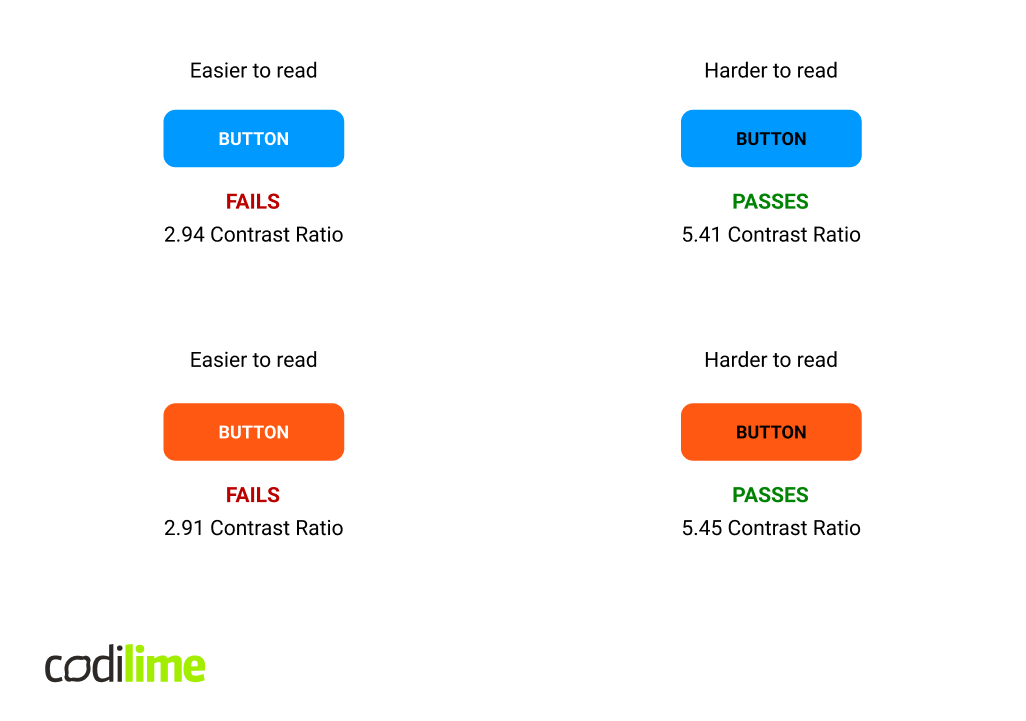
This problem with contrast usually occurs when using blue and orange backgrounds. Contrast defined by WCAG does not take into account the luminosity of white text in these circumstances. White is the pure lightness without any hue or saturation and it is the peak contrast form. This is exactly why the button on the left is more readable. The reason why contrast fails here is that the background color is also very vivid. The computer thinks the text and the background have similar brightness and luminosity - but we should look at the users, not what the computer thinks. That is why the designer’s eye is so important.
Some of the more interesting statistics around the color deficiencies are:
- Approximately 8% of men and 0.5% of women of Northern European descent are color blind, Source: National Eye Institute.
- More than 99% of all color blind people are not really color blind but color deficient, Source: Colblindor.
- The most common type of color blindness is red-green color blindness, Source: American Academy of Ophthalmology.
- The least common form of color blindness is blue-yellow color blindness and it affects men and women equally, Source: Prevent Blindness.
- Inherited color blindness is most common, but it can also occur from physical or chemical damage to the eye, the optic nerve, or parts of the brain, Source: American Optometric Association.
- 1 in 33,000 people suffer from Achromatopsia (complete color blindness), Source: National Organization for Rare Disorders.
It turns out that men and women’s brains are a bit different when it comes to color perception - Israel Abramov, of CUNY’s Brooklyn College, has conducted a study and asked men and women to break down the hue of a color and to assign a percentage to the categories red, yellow, green, and blue. It showed that women were more adept at telling a difference between subtle color gradations than men. With hues that were mainly green or yellow, women distinguished slight color differences that men considered identical. What is more interesting is that hues that were more orange to women, were seen as more yellow by men - slightly longer wavelengths of light were required for men to see the same hues as women.
On the other hand, men were quicker to tell the difference between light and dark bars on screen and to tell when changes in brightness were happening across the space. This was more evident when bars were more narrow, which suggests that men are more sensitive to fine details and rapid movement.
Best practices for color in UX
- Follow the brand guidelines
The first vital aspect is to follow the client’s established style guidelines. When designing for a company or organization, they become the cornerstone of our choices and usually they specify the colors we need to adhere to - the chosen palette and brand colors that define the brand’s identity. - Use colors consistently
Consistency is a key UX design principle. Whichever colors you choose - designers must adhere to the choices throughout the application. When a specific color is used for a component, we usually stick to it - but in some cases it is actually beneficial to use a different color if it helps in focusing the user's attention to an outlier. - Use the 60-30-10 rule
According to this rule, in any design, 60 percent of the area should be covered by the dominant color, 30 percent by the secondary color, and 10 percent by the accent color. These proportions help create balance and prevent designers from making a chaotic mess from the interface. Typically, the dominant and secondary colors should be relatively neutral colors. We reserve the accent color for what we want to stand out the most on your page - like the call to action button. - Ensure better localization
As previously mentioned, colors have varying meanings throughout the cultures. Most of the UX/UI designers tend to adhere to Western interpretations and do not consider the cultural differences. We need to make sure that we prevent any negative interpretation. Localization can help with this - with different designs for varying cultural backgrounds, we can meet the needs of users from different parts of our globe, avoiding any negative stereotypes or cultural connotations. - Use proper contrast
Color contrast is vital for good user experience. Using external tools to confirm the contrast ratios, or using a palette generator with contrasts already taken into consideration, we can quickly create a solid foundation for our interface colors - but at the same time designers need to use their expertise and practice to choose and modify as needed. - Test all choices
Whatever we do in UI/UX, it is always best to test the choices with real users and the most common and easy way to validate a design is through A/B testing - where two groups of users use the same interface but with different interface features. This can very quickly inform us about the validity of the design and its effectiveness.
Conclusion
The art of choosing a product color, creating a color palette, and then using it when designing is a very deep topic and it should never be boiled down to just a lucky guess. It takes a knowledgeable designer and only through iteration and understanding the rules will they achieve a good interface design, harnessing the power of color. Good color choices can enhance brand perception, draw attention and encourage interactions, impact users’ emotions, and increase usability. This in turn will allow the product and its brand to shine, both in terms of user experience and through its visual identity.


