User experience is a hot topic when it comes to developing virtually any kind of digital product. Good UX design is a key element to attract customers and maintain their loyalty. On the other hand, even the best product may lose its potential due to bad UX design. The importance of UX is even more pronounced with network apps, where huge amounts of information need to be shown clearly and neatly. Here, good visibility also minimizes the number of errors users make and speeds up failure detection. Read the article to see how CodiLime deals with UX.
UX - a concise introduction
Before we delve into UX for network apps, I’ll take a moment to explain what user experience really is.
User experience (UX for short) is the process of designing the interaction between an end-user and a product. That interaction today tends to be with digital products (e.g. mobile apps). Ultimately, the UX process is designed to create a product which is useful, easy to use and intuitive, thus improving customer satisfaction. UX is a multi-disciplinary field encompassing interaction design, information architecture, visual design, usability, and human-computer interaction. UX is tightly connected with user interface design (UI), or space in which human-computer interaction occurs.
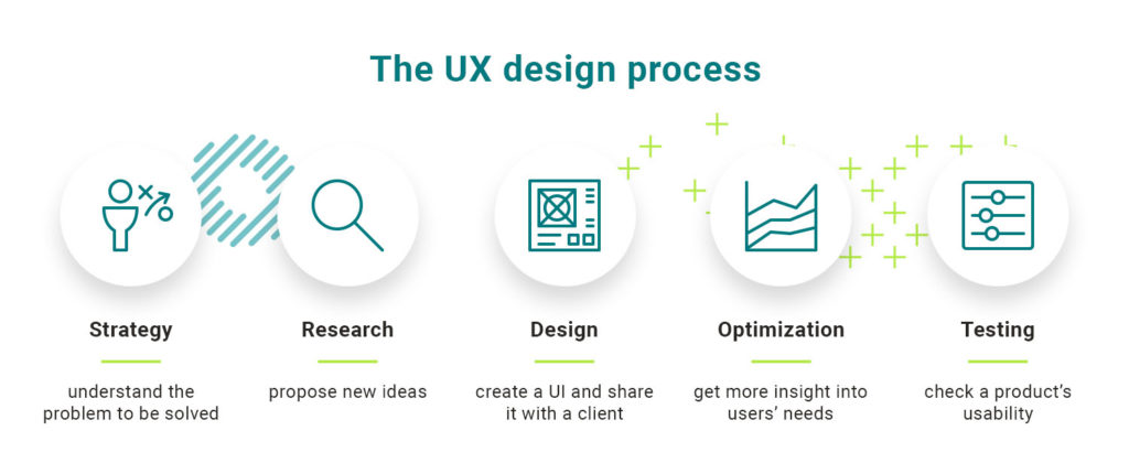
The UX process usually includes the following stages. The first, Strategy, involves understanding the problem to be solved. At this stage we create user personas, which represent the hypothetical group of users, and define use cases in these personas to test the product. In the next stage, Research, the UX team studies competitors and using current design trends, proposes new ideas and fuels innovations. In the Design phase, data structure and key UI elements are designed and shared with the client. Optimization is the fourth stage, and involves gathering insights into users’ needs, values and their work. These insights are then applied to UI design to further improve the user experience. Testing rounds out the process, with usability testing performed to ensure that a given product helps users achieve their goals quickly and easily.

UX process at CodiLime
The previous section brings the typical UX process a bit closer. However, every UX team has the freedom to modify the steps and customize their definitions, depending on the project's requirements. What does the UX process look like at CodiLime?

The whole process is iterative – we want to emphasize that. At CodiLime, we believe that iterative processes give the best results, and the design team supports the client and cooperates on every process step.
What does CodiLime’s UX approach look like in detail?
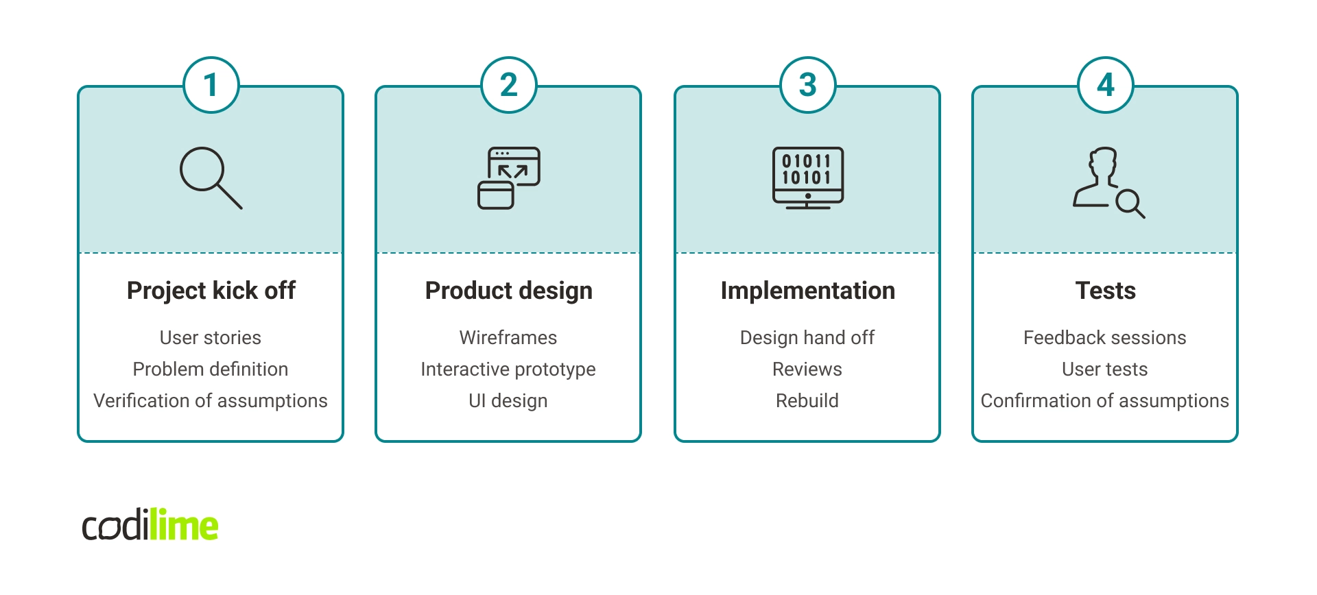
- Project kick off – we create user stories, define a problem, and verify the assumptions at this stage. Everything is aimed at knowing the target audience better and making the best-adjusted product.
- Product design – work on wireframes, interactive prototype, and UI design take place here.
- Implementation – time for review and rebuild (if needed) of the design.
- Tests – during the test stage, we run user test feedback sessions and recheck that the assumptions are met.
Let's move into UX business benefits, where possible boosters for your company will be pointed out.
The business benefits of sound UX design
Because the UX design process is so complex, it is wise to ask whether the investment in UX really pays off. The answer, in a nutshell, is yes, and the numbers do the talking.
- Every dollar invested in UX nets an ROI of 9,900%.
- 88% of users are more likely to not come back to a website after a poor user experience.
- 94% of all first impressions are design-related.
- Almost 75% of respondents have improved product quality with design.
Also, a positive user experience will help improve customer retention and loyalty, that in turn can increase conversion rates, which is why UX design is important.
In some businesses, UX used to be eclipsed or even skipped. However, we happily observed the increase of awareness of the UX importance during product development – companies started linking the good UX design with the increasing level of conversions, cost reduction and brand equity .
UX: network apps vs. standard apps
With this myriad of benefits in mind, let’s take a look at how UX design can be applied in network apps.
CodiLime has strong expertise in network and cloud-native solutions. Software Defined Networks (SDN), Network Function Virtualization (NFV) and multi-cloud strategies are our everyday life. At first glance, it may seem that such solutions have nothing in common with UX design. When you think about designing user experience, standard apps like mobile apps for fitness or banking apps first jump to mind. Yet, a sound UX design also plays an important role in creating efficient network solutions, where large amounts of data must be visualized.
Before we can start designing such a network app, there is one serious challenge to overcome. You need a UX designer who knows the basic principles behind networks and their functions. A good network app can’t be designed without knowing how such a network works. This knowledge is very specific and hard to come by. When it is combined with a broader perspective on networks, one might go so far as to say that few people on the market actually possess it. If they do, however, it’s because they’ve been working at the confluence of networking and UX/UI long enough to have drawn these seemingly disparate fields into a single focus. CodiLime’s UX designers have done just that, and it has positioned us to understand clients’ network-specific requirements.
Another important aspect of UX design is the difference in the size of network systems and standard apps. From a UX designer’s point of view, the main differentiator is the number of screens that need to be drawn. In the case of standard apps, there are roughly 100 screens. With network apps, which must display far more information on the various screens involved, a UX designer draws a jaw-dropping 5000 screens.
The same is also true when it comes to the data that need to be visualized. In a network app, the constant and enormous flow of information has to be structured in the UI in order to optimize the user experience for network professionals. When the UI is designed properly, the number of user-made errors falls and failure detection becomes simpler. This reduces operational costs as well as the time required to fix errors.
The network applications usually contain a considerable amount of data. UX helps show them clearly, and in an intuitive way for the user. See how to provide great UX in network applications.
Testing that adds value
Last but not least, testing is an important phase that often determines whether a project finishes successfully. Typically, apps are tested in one of two ways. Either they are outsourced to an external company which employs testers who test according to given scenarios, or random people in the company are asked to use the app and send feedback. These ways work when a standard app (e.g. fitness or social media app) needs testing. But with a complex network app, it is virtually impossible to find the testers who know the intricacies of networks well enough to be useful judges. Being a networking company that is loaded with network engineering talent, CodiLime can tackle this challenge, spotting issues that nobody else can even see. Therefore we are sure that our UX designs meet the requirements of end-users who are network specialists.
If you are looking for more tips on avoiding errors during designing network applications, check out the previous article about UX dos and don'ts.
Usability vs. User Experience in network applications
While creating the network application, it is essential to include both usability and user experience. How do they differ?
Usability is a design rule including aspects like button size, legibility, and the selection of user-friendly contrasts and colors for the application. Focusing on usability principles allows for better adjusting the product's design to meet the needs of its target audience.
User Experience contains both usability principles and the product's value proposition – for example, by simplifying the interaction with the product. A good UX aims to eliminate frustration and respond directly to users' needs.
Is usability more important than UX? There is no one good answer – every project is different and requires an individual approach. In the startups' case, it could occur that implementing the UX-first approach is unprofitable at the beginning.
Key takeaways
As you can see, UX design in network apps differs considerably from the way a standard app is designed. End-users of network apps are professionals with complex and exacting requirements. To meet these challenges, a UX designer must have a thorough understanding of network principles. Only then is it possible to design a user experience that responds to the needs of network engineers. To ensure that these needs are really met, testing has to be performed by network engineers themselves, who will be the best judges of an app’s usability and effectiveness.


